Mastering Product Details Page Optimization for Ecommerce Websites
Article last updated:
Article first published:
When it comes to e-commerce success, the devil is in the details—product details, to be exact.
Think about it: a potential customer lands on your product page, intrigued by an ad or search result. What happens next depends entirely on how well your product details communicate value, instill trust, and eliminate doubts.
Optimizing product details can dramatically boost conversion rates, leading to higher sales and customer satisfaction. Whether it’s crafting compelling descriptions, showcasing vibrant imagery, or highlighting must-know specs, fine-tuning your product details is one of the most effective ways to turn browsers into buyers.
But what makes product details so critical to conversion rates?
Why product details matter for conversion rate optimization (CRO)
Product details are key to any effective product page optimization strategy, providing customers with the information they need to make a purchase.
Let’s break it down. Detailed product descriptions, high-quality images, and customer reviews all play a pivotal role in shaping purchase decisions. According to Bizcognia, the global average e-commerce conversion rate is around 2.6%, with search traffic performing slightly better at 2.8%. Industries like food and beverage do even better, hitting a 4.6% average—largely because they prioritize transparent, well-organized product information.
These numbers don’t lie: optimized product details directly drive sales.
But what makes product details so transformative? Because they eliminate decision friction. When customers come across a product page with unclear specifications or blurry images, questions start piling up: "Will this work for me? Is it worth it?" The result? They leave without buying.
On the flip side, detailed specs, usage instructions, and multiple high-res images put those doubts to rest, creating a smooth, confident shopping experience. For entrepreneurs focusing on dropshipping products that drive sales, providing clear, thorough product details can make all the difference in building trust and encouraging conversions, especially when customers can't physically inspect items.
Real-world examples prove how powerful this is. Take HD Supply, for instance. By revamping its search feature to let shoppers view product details right from the search interface, the brand saw a 16% boost in search-related revenue.
Clearly, product details are much more than just words and pictures. When you prioritize product detail optimization, you’re improving the shopping experience while driving real growth for your business.
Key elements of product details for CRO success
Compelling product titles
A product title is often the first impression, so it needs to resonate with the customer’s intent instantly. Use clear, action-oriented language that highlights the product's purpose, like “Compact Portable Espresso Machine for On-the-Go Coffee Lovers” instead of “Model X123.” Keep it simple and avoid industry jargon that might leave buyers scratching their heads.
Persuasive product descriptions
A great product description should convince the shopper. So, talk about benefits, not just features, using the "FAB" method: Features, Advantages, and Benefits. For example, instead of saying, “This camera has a 4K sensor,” explain, “Capture every detail with 4K resolution for stunning, life-like images.” Emotional, sensory words like “luxuriously soft” or “engineered for your ultimate comfort” tap into what customers aspire to feel. Remember, people buy the experience, not just the product.
High-impact visuals
Seeing is believing, especially online. Show off your product with high-quality images from every angle, and throw in some lifestyle shots to build trust and desirability. Think: a tent pitched on a scenic mountainside to add emotional appeal. Another great tip is adding videos. Use them to demonstrate product functionality—like a hairdryer effortlessly taming frizz—to remove decision friction.
Clear specifications and key details
Shoppers want answers fast, so make specs like dimensions, materials, and compatibility super easy to find. Use bullet points or a neat table for quick scanning. Don’t hide sizing info in a sea of text—say it outright, like “Fits mattresses up to 12 inches” or “Dimensions: 30x20x10 cm.” The clearer you are, the less hesitation customers will feel.
Transparent pricing and availability
Price matters—a lot. Make it front and center, using discount pricing or promotions highlighted. Don’t forget shipping costs and delivery timelines—be upfront and clear. If urgency helps, use tools like stock alerts (“Only 2 left!”) or countdown timers (“Sale ends in 3 hours”) to nudge buyers into action.
Social proof and trust signals
Nothing reassures customers more than seeing others trust a product, so display customer reviews, ratings, and testimonials prominently. For example, you can show “4.8 stars from 2,500 reviews” to build confidence. Badges like “Best Seller” or “Top Rated” are also great for lending credibility, while tags like “Trending Now” or “Recently Purchased” create a sense of popularity that encourages action.
Personalization and recommendations
Shopping feels special when it’s tailored just for you. Suggest complementary products (like a laptop case for that new laptop) or premium upgrades (a deluxe version, perhaps?). Use browsing history to create smart suggestions like, “People who viewed this also bought…” Personal touches like these make the experience feel curated—and they just might add more items to your customer’s cart.
Conversion-driven product page design
Let’s explore the three key elements that shape a conversion-driven product page design:
Layout and visual hierarchy
Think of your product page as a stage, where your product is the star of the show. You want to highlight the essentials right at the top—like product name, price, and key features. This “above the fold” placement ensures your customers don’t have to dig for the information they need to make a decision.

Next comes your calls-to-action (CTA). CTA buttons, such as “Add to Cart” or “Buy Now,” are the most persuasive elements on the page, so make sure they grab attention and spark action. Use bold, contrasting colors that stand out against a neutral background to make these buttons impossible to miss.
To improve navigation without stealing focus, consider experimenting with supportive elements like breadcrumb trails or secondary CTAs, such as “Add to Wishlist.” These additions enhance the user experience and keep the customer journey flowing smoothly.
User-friendly navigation
Make it easy for customers to explore product variants like sizes, colors, or configurations directly on the product page. Incorporate interactive features such as swatches or dropdown menus, so they can visualize choices—whether it’s seeing a shirt in blue or selecting the perfect accessory for a gadget.
For e-commerce stores with larger inventories, efficient filtering and sorting options are a must. Features like “Sort by Price” or “Filter by Availability” can help customers zero in on what they want quickly. Clear navigation bars and logically categorized products add to this sense of order, creating a user-friendly experience that keeps frustration at bay and engagement high.
Mobile-first optimization

With mobile devices dominating online shopping, a mobile-first design is no longer optional. Your product pages should adapt flawlessly to smaller screens without sacrificing clarity or speed. Make sure text, buttons, and images scale dynamically, ensuring everything is easy to read and interact with for visitors.
The checkout process deserves your special attention here. Streamline workflows by offering features like autofill for shipping details and payment options such as Apple Pay or Google Pay. Adding a one-tap “Buy Now” button can also remove unnecessary steps and cater to mobile shoppers’ need for speed and convenience.
Psychological triggers for boosting conversions
When you understand and know how to leverage psychological triggers, you can significantly enhance your e-commerce CRO. You can tap into innate customer behaviors and emotions, thereby creating compelling shopping experiences that drive action.
Essentially, you want to focus on the following three powerful psychological triggers:
Urgency and scarcity
When products or offers are perceived as limited, the desire to secure them intensifies.
Implementing limited-time offers or displaying messages like "Only X left in stock" can create this effect. For instance, countdown timers for flash sales visibly demonstrate the ticking clock, prompting immediate purchases.

Behavioral economics suggest that such tactics can increase conversion rates by up to 50%, as they tap into the fear of missing out (FOMO) and loss aversion. More on this in a bit.
Trust and security
A secure and transparent shopping environment fosters confidence, which is crucial for conversion.
Display secure payment logos and trust seals to reassure shoppers about the safety of their transactions. You can also highlight hassle-free returns and guarantees to further reduce purchase anxiety and make customers more comfortable completing their orders.

FOMO
FOMO is a psychological phenomenon where individuals fear missing out on rewarding experiences.
In e-commerce, you can leverage this by showcasing labels that signal high demand and exclusivity—like "Trending," "Best Seller," or "Limited Edition." Social proof pop-ups, such as notifications that "John just bought this product" or "Only 2 rooms left” further enhance this effect by showing real-time purchases.

Studies indicate that about 60% of shoppers have made purchases due to FOMO, particularly when promotions are time-sensitive or stock is limited.
Measuring success and continuous CRO improvements
Conversion rate optimization is not a one-and-done task—it’s a continuous process of measuring, testing, and refining. Here’s how you can move forward effectively.
Pinpoint and focus on the right metrics
To know if your CRO efforts are working, you need to monitor the ecommerce metrics that matter most. Start with your conversion rate—the percentage of visitors who take a desired action, like making a purchase. This is your primary indicator of success, so make it a habit to track it weekly or monthly. Beyond conversion rates, look at cart abandonment rates to identify where customers are hesitating. If many visitors are leaving their carts without completing the purchase, you might need to address potential obstacles like unclear shipping costs, lengthy checkout processes, or concerns about return policies. Finally, measure time spent on product pages. Are customers spending enough time engaging with your content, or are they bouncing quickly? A high bounce rate combined with short session durations often signals issues like a lack of compelling product descriptions, unclear images, or poorly placed CTAs.
Plan and execute A/B tests
The A/B testing strategy is an invaluable tool for optimizing product pages. Start with your product titles, descriptions, and images. Test different styles, tones, and formats to see which resonates most with your audience. For example, a technical title might appeal to one demographic, while a benefit-focused title might perform better for another. Experimenting with CTAs can also yield insights. Test different wording (“Add to Cart” vs. “Buy Now”), colors, or placements to see what drives more clicks. Trust signals, like secure payment logos or “Free Returns” badges, are another area to explore. Adding or repositioning these elements can significantly impact customer confidence. Lastly, test variations of your page layout, such as placing product specifications higher or changing how images are displayed, to see how these adjustments affect conversions. 💡 Top Tip: Omniconvert simplifies the entire testing process, from setup to actionable insights. With its intuitive interface, segmentation tools, and robust reporting, you can focus on what matters: creating an optimized experience that drives conversions. Learn more here .
Collect and act on customer feedback
Your customers hold the answers to why your product pages might not be converting as well as you’d like. Surveys are a great starting point to tap into their insights and gather quality data. Ask direct, actionable questions like, “What almost stopped you from completing your purchase?” or “Was there anything missing from this product page?” These responses can uncover specific issues, like missing dimensions or unclear shipping policies. Real-time tools like live chat can also highlight gaps in your product pages. If customers frequently ask the same questions—about sizing, compatibility, or return options—that’s your cue to address those details upfront. Additionally, read through customer reviews. Look for patterns in complaints or suggestions. For example, if multiple customers mention difficulty understanding product features, your descriptions might need an overhaul. Once you gather feedback, prioritize fixes based on urgency and impact. Small adjustments, like adding a shipping FAQ, can often lead to big improvements in trust and conversions.
Takeaway thoughts
Product pages are the silent salespeople of your e-commerce store, and their impact on conversions can’t be overstated. By optimizing key details like titles, visuals, and trust signals, you create a shopping experience that speaks directly to your customers’ needs and encourages conversion.
But remember, product pages aren’t meant to stay static. Regularly updating them based on performance metrics and customer feedback ensures they stay relevant and effective.
Treat these pages as living assets that evolve with your business and adapt to an already competitive market. To elevate your optimization efforts, try Omniconvert.
This powerful platform simplifies A/B testing, personalization, and real-time customer insights, giving you the tools to refine every detail of your product pages. Book a call with our expert team and discover how Omniconvert can help your business.

Not using Omniconvert Explore yet?
Run FREE A/B tests on 50,000 website visitors →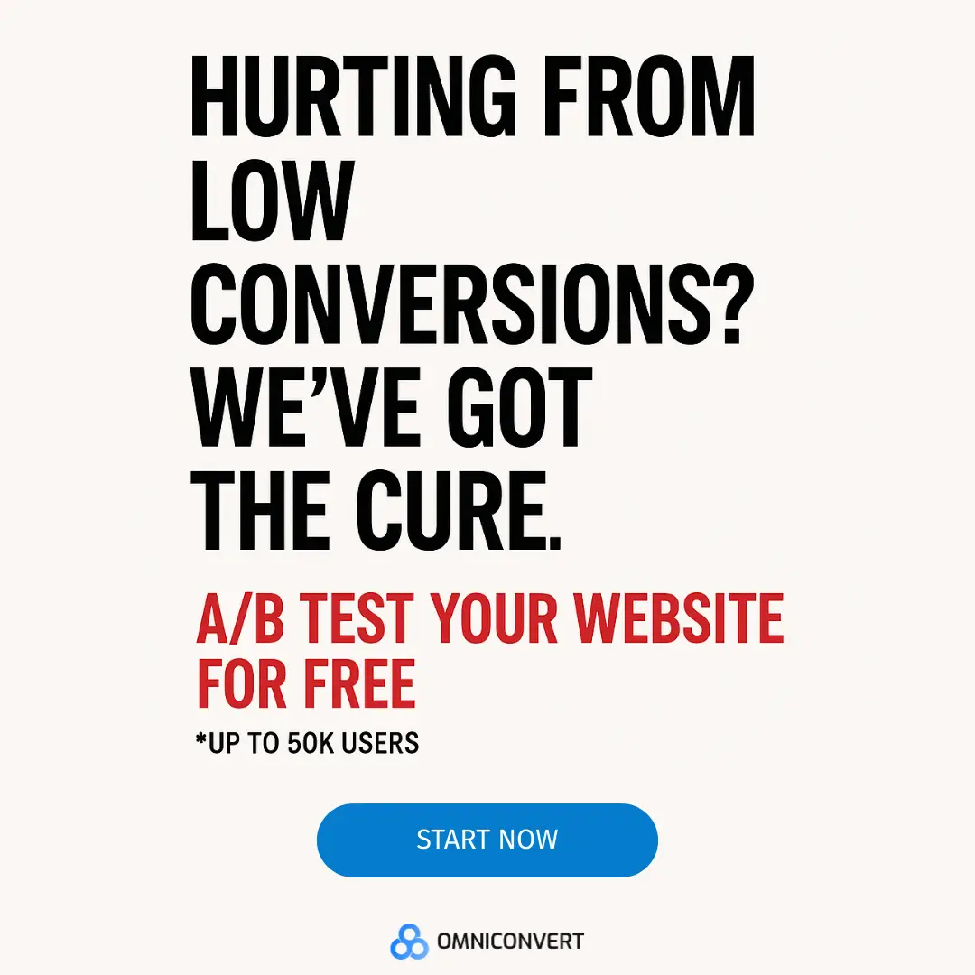

AI-Powered CRO
Audit for eCommerce
Find your biggest conversion leaks in 15 minutes.
Benchmark UX, accessibility, and data hygiene then unlock tailored A/B testing ideas.
Unlock my CRO score

Sign up to our bi-monthly newsletter!
Actionable eCommerce insights only.

Master what matters most in eCommerce
✅ Get more loyal customers
✅ Improve Customer Lifetime Value
✅ Maximize profits
Discover all features30-day free trial, no credit card necessary.
If you liked this article, make it shine on your page :)