


The checkout page is the final and most crucial step in the eCommerce buying journey. While businesses invest heavily in driving traffic, optimizing product pages, and running promotions, all of that effort is wasted if shoppers abandon their carts at checkout. A poorly designed or complicated checkout process can lead to frustration, lost sales, and high bounce rates, impacting overall revenue.
Optimizing the checkout process isn’t just about making transactions seamless—it’s about creating an experience that is fast, secure, and frictionless while reinforcing trust and confidence in the buyer. From minimizing distractions to offering multiple payment options, small improvements can significantly reduce cart abandonment rates and increase conversion rates.
Throughout this article, you will find the main reasons why shoppers abandon their carts at checkout, what an ideal checkout process should look like, and 25 best practices to optimize your checkout experience. Whether you run a small online store or a large-scale eCommerce business, these strategies will help you streamline the buying process and improve your bottom line.
Why Shoppers Abandon the Checkout Page
Cart abandonment is a major challenge for eCommerce businesses, with studies showing that the average global cart abandonment rate is around 70%. This means that for every 10 shoppers who reach the checkout page, 7 leave without completing their purchase. To reduce abandonment, it’s essential to understand the main reasons why shoppers bounce at this critical stage.
Top Reasons for Checkout Abandonment
Here you will find the main reasons why the user leaves the cart:
| Reason for Abandonment | Percentage of Shoppers Affected |
|---|---|
| Unexpected extra costs (shipping, taxes) | 48% |
| Forced account creation | 24% |
| Complicated checkout process | 17% |
| Lack of trust in site security | 18% |
| Limited payment options | 9% |
| Slow website or checkout errors | 13% |
| No clear return or refund policy | 8% |
1. Unexpected Extra Costs
One of the biggest deterrents to completing a purchase is hidden fees that appear at checkout, such as high shipping costs, taxes, or service fees. Customers feel misled if they are expecting a lower price, leading them to abandon their carts and look for alternatives. Offering transparent pricing and displaying shipping costs upfront can help reduce this issue.
2. Forced Account Creation
Many shoppers are unwilling to create an account just to make a purchase. If guest checkout isn’t available, they may abandon their cart rather than go through the hassle of signing up. Allowing guest checkout options and offering account creation after the purchase can improve conversions.
3. Complicated Checkout Process
A long or confusing checkout process with too many form fields, unnecessary steps, or unclear instructions can frustrate customers. The more friction in the process, the higher the likelihood of abandonment. Keeping checkout simple, intuitive, and streamlined is key to retaining buyers.
4. Security Concerns
Customers are cautious when providing their credit card details and personal information online. If a website lacks trust signals such as SSL certificates, secure payment logos, and customer reviews, shoppers may hesitate to complete their purchase. Ensuring a secure and trustworthy checkout page is crucial for boosting confidence.
5. Limited Payment Options
Consumers have different preferences when it comes to payment methods. If a checkout page only offers credit card payments but lacks digital wallets like PayPal, Apple Pay, Google Pay, international payment gateways, or buy-now-pay-later (BNPL) options, some customers may leave in search of a more convenient store.
6. Slow Website or Checkout Errors
A checkout page that loads slowly, crashes, or has glitches can quickly turn customers away. Studies show that even a 1-second delay in page load time can reduce conversions by 7%. Ensuring a fast and responsive checkout experience is vital for keeping customers engaged.
7. No Clear Return or Refund Policy
Shoppers want reassurance that they can return a product if it doesn’t meet their expectations. If a checkout page doesn’t clearly display the return and refund policy, customers may hesitate to finalize their purchase. Providing a hassle-free return policy upfront can help build trust and reduce abandonment.
25 eCommerce Checkout Optimization Best Practices
A seamless, user-friendly checkout experience is essential for reducing cart abandonment and increasing conversions. When shoppers encounter friction—whether from unexpected costs, complex navigation, or lack of trust—they are more likely to leave without completing their purchase. Implementing strategic checkout optimizations can eliminate these obstacles and lead to higher revenue. Below are 25 best practices that successful eCommerce brands use to convert more:
1. Show Progress with a Checkout Progress Indicator
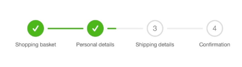
When users don’t know how many steps remain, they may assume the process is too long or complicated and leave before completing their purchase. A checkout progress indicator provides a visual guide, showing customers exactly where they are in the process and how much remains.
A well-designed progress indicator helps customers feel in control of their checkout journey. It reassures them that completing the purchase won’t take too long, which is especially important for mobile shoppers who expect a streamlined experience. Additionally, it helps reduce frustration by setting clear expectations, ensuring that customers don’t feel stuck in an endless series of forms and fields.
Many leading brands incorporate a multi-step progress bar at the top of the checkout page, displaying clear sections such as “Shipping,” “Billing,” and “Review Order.” This approach ensures customers understand what’s next, keeping them engaged until the final confirmation.
2. List All Costs Upfront to Avoid Surprises

Unexpected costs—such as shipping fees, taxes, and service charges—are one of the most common reasons for checkout abandonment. Customers expect transparency when making a purchase, and when additional fees appear late in the checkout process, it can create frustration and immediate drop-off.
To prevent this, all costs should be clearly displayed before customers proceed to checkout. Many successful eCommerce brands provide real-time cost calculations, showing shipping costs, taxes, and any additional fees directly on the product page or cart summary. This eliminates last-minute surprises, giving customers full confidence in the total price before they commit to payment.
This level of transparency builds trust and helps customers make informed purchasing decisions. In addition to listing all costs upfront, businesses can also offer shipping calculators, which allow users to enter their location and see estimated fees before proceeding. A smooth pricing experience ensures that shoppers remain engaged and don’t feel misled at the last step.
3. Offer Guest or Express Checkout

Accounts are useful for loyalty programs and repeat customers, but forcing registration during checkout can increase frustration and reduce conversions.
To optimize the checkout experience, businesses should provide a guest checkout option, allowing users to complete their purchases without logging in. This removes obstacles and speeds up the process, making it easier for shoppers who are in a hurry or simply don’t want to create an account.
In addition, express checkout options—such as Google Pay, Apple Pay, and PayPal One-Touch—allow users to skip form-filling entirely, completing their transaction in just a few clicks. This is particularly beneficial for mobile shoppers, where long forms and multiple input fields can deter purchases.
4. Showcase Trust Signals on the Checkout Page

Trust is a major factor in online purchases, especially for first-time customers who may be hesitant to enter their payment details. Lack of trust indicators—such as security badges, customer testimonials, or refund policies—can result in checkout abandonment due to concerns about data security and legitimacy.
To reassure customers, businesses should prominently display trust signals throughout the checkout process. This can include:
- SSL certificates confirm encrypted transactions.
- Payment security logos (Visa Secure, PayPal Verified, etc.).
- Customer service guarantees (easy returns, money-back policies).
- Verified customer reviews or testimonials.
These elements help build confidence and eliminate doubt at the final purchase stage. Brands that clearly communicate their security measures and policies are more likely to gain customer trust and see higher conversion rates.
Patagonia includes multiple trust signals on its checkout page, such as secure payment icons and clear return policies, reassuring customers that their purchase is safe.
5. Create a Sense of Urgency

A powerful way to motivate customers to complete their purchases is by creating a sense of urgency during the checkout process. When shoppers perceive that they might miss out on a deal or that stock is running low, they are more likely to proceed with their purchase instead of postponing it.
Retailers often use limited-time discounts, countdown timers, or stock availability notifications to increase urgency. Messages such as “Only 2 left in stock!” or “Flash Sale: Expires in 10 minutes!” can push hesitant buyers to act quickly. This strategy is particularly effective in industries like fashion, electronics, and event ticketing, where demand fluctuates rapidly.
However, urgency tactics must be used authentically. If customers notice that “limited stock” warnings appear every time they visit, they may lose trust in the brand. The key is to implement real-time stock updates and genuinely time-sensitive promotions that enhance the shopping experience rather than manipulate it.
6. Make the Checkout Process Mobile-Friendly
Many customers browse on mobile devices but abandon their carts due to frustrating checkout experiences, including slow loading times, hard-to-click buttons, and excessive form fields. A seamless mobile experience ensures customers can complete their purchases effortlessly.
To optimize mobile checkout, businesses should focus on simplifying the process. One of the most effective strategies is using one-page checkouts that reduce unnecessary scrolling and load times. Forms should be kept to a minimum, only requesting essential information, while smart autofill options help speed up the process. Additionally, touch-friendly design elements like large buttons, dropdown menus, and mobile-responsive keyboards ensure easy interaction.
A key factor in mobile conversion is page speed. 53% of users abandon a mobile site if it takes longer than three seconds to load. Optimizing images, reducing unnecessary scripts, and using accelerated mobile pages (AMP) can significantly enhance performance.
7. Allow Smart Form Filling Forms

Filling out shipping and billing details can be one of the most tedious parts of the checkout process, often leading to cart abandonment. Manually entering information—especially on mobile—can be frustrating, increasing the chances of a user leaving without completing their order. By enabling autofill and smart form-filling, you can streamline checkout and reduce friction.
Most modern browsers and payment providers, like Google Autofill and Apple Pay, offer pre-stored addresses and payment details that can be auto-populated with a single tap. This feature significantly speeds up the checkout process while minimizing errors. Smart forms can also use AI-powered suggestions to predict inputs based on prior customer behavior, reducing unnecessary typing.
Allowing customers to save their information for future purchases further enhances convenience. Returning users should be able to retrieve their shipping and billing details instantly, eliminating the need to re-enter information.
8. Use Upsells or Cross-Sells to Increase Average Order Value

Checkout isn’t just the final step of the shopping process—it’s also an opportunity to increase revenue through strategic upselling and cross-selling. Many businesses focus solely on completing the sale, missing the chance to suggest complementary or upgraded products that can enhance the customer’s purchase.
Upselling involves recommending higher-value products or upgraded versions of what the customer is buying. For example, if a customer is purchasing a laptop, suggesting a model with better features or additional storage can lead to a bigger sale. Cross-selling, on the other hand, promotes related items—for instance, suggesting a phone case when a customer buys a smartphone.
For upselling and cross-selling to work effectively, recommendations should be relevant and non-intrusive. Placing these suggestions subtly on the checkout page, with clear value propositions and pricing, ensures customers consider them without feeling pressured.
9. Offer Multiple Payment Options

Customers expect flexibility when it comes to payment. If they reach checkout and don’t see their preferred payment method, they may abandon the cart entirely. Offering multiple payment options ensures that no customer is excluded due to payment restrictions.
At a minimum, checkout should support credit and debit cards, but modern shoppers also look for alternative payment methods such as digital wallets (PayPal, Apple Pay, Google Pay) and Buy Now, Pay Later (BNPL) services like Klarna and Afterpay. These payment methods add convenience and cater to customers who prefer faster or more flexible payment solutions.
For international brands, supporting local payment methods is equally critical. Some markets rely heavily on digital wallets or regional services like Alipay (China) or iDEAL (Netherlands). Adapting to regional payment preferences helps businesses expand their customer base and improve conversions.
10. Enable Chat Support During Checkout
Many customers hesitate at checkout due to last-minute doubts or concerns. These could range from uncertainty about return policies and shipping times to security concerns regarding payment. If they can’t find an immediate answer, they’re likely to abandon the purchase and possibly never return.
Adding live chat or AI-powered chatbots during checkout helps customers resolve their questions in real-time, eliminating potential roadblocks. A well-integrated chat feature can assist with:
- Order clarification (e.g., confirming product details or shipping estimates).
- Payment issues (e.g., failed transactions or alternative payment options).
- Shipping concerns (e.g., estimated delivery times).
Live chat should be easy to access, ideally appearing as a floating widget at checkout. AI chatbots can handle common inquiries instantly, while live agents can step in for complex concerns, ensuring customers feel supported throughout their purchase journey.
11. Provide Clear and Transparent Return & Refund Policies

One of the biggest concerns for online shoppers is what happens if the product doesn’t meet their expectations. If your return and refund policy isn’t clearly visible on the checkout page, customers may hesitate to complete their purchase, fearing a complicated or rigid return process. A lack of transparency can lead to abandoned carts and lost sales, especially for businesses selling high-ticket items, apparel, or products where sizing and fit are essential.
A well-crafted return and refund policy should be easy to understand and reassuring. Customers should be able to find key details about return timeframes, refund processing, and any applicable conditions without needing to dig through multiple pages. Retailers that offer hassle-free returns and free shipping on returns tend to see higher conversions, as customers feel more confident purchasing knowing they have a safety net. This is particularly important for fashion, electronics, and furniture brands, where returns are more common.
12. Use Exit-Intent Popups to Recover Abandoning Shoppers
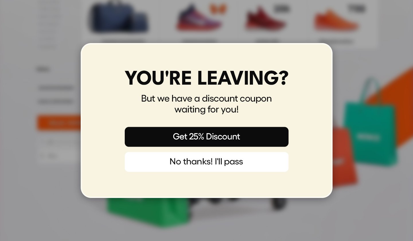
Many customers reach the checkout page only to second-guess their decision or get distracted before completing the purchase. Exit-intent popups provide an effective way to capture these abandoning shoppers by displaying a last-minute offer or incentive when they attempt to leave the page.
An exit-intent popup can be used in several ways to re-engage hesitant buyers. Offering a limited-time discount can encourage price-sensitive shoppers to complete their order while highlighting free shipping or easy returns can help overcome objections. Some retailers also allow customers to save their cart and receive an email reminder, ensuring they can return and complete their purchase later.
These popups are particularly useful for high-cart-value products where customers may need a final push to commit. AI-powered exit popups can also be personalized based on user behavior, such as offering an exclusive discount to first-time visitors or displaying urgency-driven messages for limited-stock items.
13. Optimize for One-Click Checkout

The more steps a checkout process has, the higher the likelihood of customers dropping off before completing their purchase. One-click checkout simplifies the process by allowing returning users to complete their orders instantly, without needing to re-enter their payment and shipping details.
This approach is particularly effective for mobile shoppers, who often find long checkout forms cumbersome. It’s also valuable for repeat customers, as it eliminates friction and encourages faster purchases. Many major eCommerce platforms, including Shopify, Amazon, and Apple Pay, offer one-click checkout options that integrate seamlessly with online stores.
By implementing a one-click checkout solution, you can significantly reduce checkout abandonment rates and create a smoother, faster purchasing experience. Amazon pioneered this feature, and it has played a key role in driving its high conversion rates and customer retention.
14. Offer Loyalty Program Signup at Checkout
Encouraging customers to join a loyalty program at checkout can increase customer retention and repeat purchases. Instead of presenting the program as a separate step after checkout, integrating it into the process makes it more seamless and appealing.
A well-designed loyalty program can offer immediate benefits, such as a discount on the current purchase, bonus reward points, or free shipping. Customers are more likely to sign up if they see instant value, rather than just long-term benefits. Retailers like Sephora and Starbucks have successfully integrated their loyalty programs into the checkout process, ensuring that customers don’t miss out on potential savings or rewards.
For best results, the sign-up process should be fast and frictionless, ideally allowing users to join with a single click using their existing checkout details. Gamification elements, such as showing progress toward a reward, can also increase engagement and encourage sign-ups.
15. Keep Customers on the Same Domain During Checkout
One of the most common mistakes in eCommerce checkout design is redirecting customers to a third-party payment processor or a different subdomain. When users are taken away from the original website during checkout, it can create confusion and mistrust, leading to abandoned carts.
Customers expect a seamless checkout experience, where they feel secure and confident about their payment details. Redirecting them to a different domain or payment page disrupts that experience and raises security concerns, as users might be unsure if they are still on the same trusted website. This issue is particularly problematic for small or lesser-known brands, where customers are more cautious about online transactions.
17% of shoppers abandon their cart because they don’t trust the website with their payment information. Ensuring that your checkout remains on the same domain, with clear SSL certification and security badges, reassures customers and reduces drop-off rates.
Major eCommerce platforms like Shopify, WooCommerce, and Magento offer integrated checkout solutions that allow businesses to keep the entire process within their domain. Apple and Google Pay also provide embedded payment options, enabling customers to complete their purchases securely without being redirected.
16. Make Applying Discounts Easy
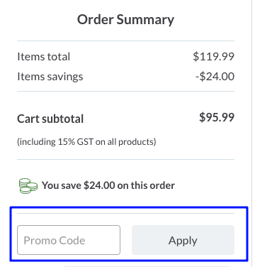
Offering discount codes is a great strategy to encourage conversions, but a complicated discount application process can frustrate customers and lead to cart abandonment. Shoppers expect a seamless way to enter and apply promo codes without having to search for instructions.
A common mistake retailers make is hiding the discount code field or requiring customers to manually input lengthy codes. This creates friction, especially for mobile users who might struggle with typing long strings of characters. Instead, the checkout should automatically apply discounts when eligible, or at least make the process effortless by:
- Providing a visible discount code field early in the checkout process.
- Enabling one-click application of available discounts.
- Offering a dropdown of available promo codes if the customer has received multiple offers.
17. Include Explanations for Important Conditions

A lack of transparency about shipping costs, return policies, or payment terms can lead to last-minute drop-offs. Many customers abandon their carts when they encounter unexpected fees or unclear policies that make them hesitant to complete the purchase.
To combat this, retailers should clearly outline conditions at every stage of the checkout process. Customers should not have to dig through fine print or be caught off guard by hidden fees, long delivery times, or strict return policies.
Some e-commerce stores display a shipping calculator that updates in real-time based on location or provide clear explanations of refund eligibility and return timeframes. Also, as a good practice, you can offer tooltips or collapsible sections with additional details, so the checkout remains uncluttered.
18. Allow Extra Perks
Shoppers love added value, and small perks can boost conversions by improving the perceived value of a purchase. These perks can range from free shipping thresholds to loyalty points, gifts, or extended warranties.
Allowing customers to choose an extra perk at checkout creates a sense of exclusivity and excitement. For example, Sephora lets customers select free product samples when they make their purchase, which enhances the shopping experience while encouraging future purchases.
Retailers can optimize this strategy by:
- Offering free shipping for orders above a certain value.
- Providing loyalty rewards points that can be redeemed on future purchases.
- Allowing customers to pick a free item when they reach a spending milestone.
19. Display Real-Time Stock Availability

One of the biggest frustrations for online shoppers is reaching the checkout page only to find that an item is out of stock. This not only creates disappointment but also increases cart abandonment rates. Displaying real-time inventory updates ensures customers are fully aware of product availability before reaching checkout.
Implementing low-stock alerts also encourages urgency, prompting customers to finalize their purchases faster. This works especially well for high-demand products where shoppers fear missing out.
20. Offer Subscription or Auto-Replenishment Options
For products that require frequent repurchasing, such as beauty products, pet supplies, household essentials, and groceries, a subscription or auto-replenishment option can significantly increase convenience for customers while boosting long-term revenue for businesses. Instead of making shoppers return to the website every few weeks to reorder, offering a subscribe-and-save model ensures that they never run out of their favorite products while benefiting from possible discounts.
A well-implemented subscription model should provide flexibility, allowing customers to set custom delivery frequencies based on their needs, such as weekly, monthly, or quarterly shipments. Furthermore, enabling easy pause, skip, or cancel options ensures that customers feel in control of their subscriptions, reducing frustration and increasing retention rates.
Brands like Dollar Shave Club have successfully built their businesses around automated product replenishment, leading to higher customer lifetime value and improved customer satisfaction. The simplicity of their model—allowing users to subscribe to razor blade deliveries at their preferred intervals—has made purchasing seamless and predictable.
21. Show a Visual Order Summary Throughout Checkout

During the checkout process, customers need constant reassurance that they are purchasing the right items at the correct price. A persistent, easy-to-read order summary serves as a point of reference, reducing anxiety and preventing last-minute hesitations that can lead to cart abandonment.
A well-designed order summary should include key details such as product name, image, quantity, price, applied discount codes, estimated shipping costs, and delivery dates. By displaying this information clearly, businesses increase transparency and build trust, ensuring that customers feel confident proceeding with their purchase.
22. Provide Multiple Delivery Options
Today’s consumers expect flexibility in shipping choices, and a one-size-fits-all approach can deter potential buyers. Some customers are willing to pay extra for faster shipping, while others prioritize affordability over speed. Offering multiple delivery options ensures that shoppers can select what best fits their needs.
A well-optimized checkout should include standard, expedited, and same-day delivery choices, along with estimated delivery dates provided upfront. Some businesses also allow in-store pickup or third-party collection points, which cater to customers who prefer a hybrid shopping experience.
23. Save Customer Preferences for Faster Future Checkouts
For returning customers, a frictionless checkout experience can be a game-changer. The need to re-enter personal details, shipping addresses, and payment information for every purchase can be tedious, increasing the likelihood of abandonment. By allowing users to save their preferences, businesses create a seamless and time-efficient checkout process that encourages repeat purchases.
A streamlined checkout experience should offer secure account creation where customers can store their details for one-click purchasing in the future. Additionally, giving users the ability to manage multiple shipping addresses is particularly useful for those who frequently send gifts or shop for family members.
24. Implement Buy Now, Pay Later (BNPL) Options
One of the biggest barriers to conversion, especially for high-ticket items, is price hesitation. Some shoppers may want to make a purchase but lack the funds upfront, while others may be reluctant to pay a large sum all at once. By integrating Buy Now, Pay Later (BNPL) options, businesses can remove this financial barrier and encourage more conversions.
BNPL services like Klarna, Afterpay, and Affirm allow customers to split their payments into manageable installments, often interest-free. This approach not only reduces sticker shock but also makes luxury or high-cost items more accessible to a broader audience.
Businesses that have integrated BNPL solutions have reported higher average order values (AOV) and lower cart abandonment rates, as customers feel more comfortable completing their purchases. Fashion and electronics retailers, in particular, have seen significant success with this approach, offering flexible financing options at checkout. These are some of the benefits:

25. Keep It Simple
The golden rule of checkout optimization is simplicity. A complex, cluttered, or multi-step checkout process introduces friction, which increases cart abandonment rates. Every additional form field, unnecessary page, or distracting element adds to the mental burden of completing a purchase.
A well-designed checkout process should be streamlined, user-friendly, and distraction-free. This means minimizing the number of form fields, eliminating redundant steps, and ensuring that pages load quickly on both desktop and mobile devices. Businesses should also reduce navigation elements, such as headers and footers, on checkout pages to keep the customer focused on completing their order rather than clicking away.
To Wrap Things Up
The checkout step presents the most friction and is particularly vulnerable to high bounce rates. Fortunately, this is also a step where you can gain valuable insights into your customers and discover how to create a smoother experience.
While each e-commerce platform and its audience have unique expectations that must be met, implementing the practices we’ve discussed will contribute to a seamless checkout process that drives conversions.