


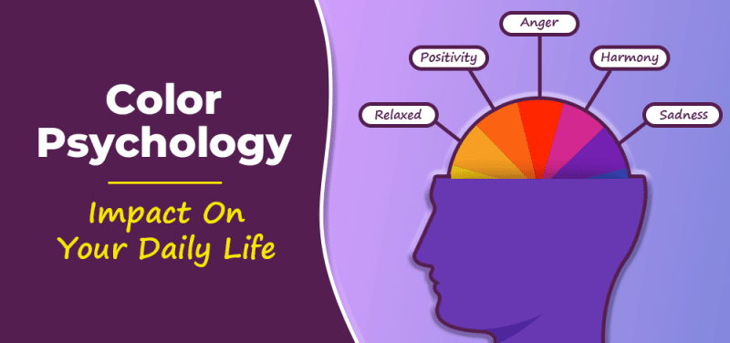
Conversion rate optimization is intricately related to web design and user experience. And because the design works directly with colors, the logical question that arises is „How does color influence conversion rate?”. Are some colors more powerful in persuading people to take a certain action? Can persuasive colors influence how we interpret on-page elements and can they have a decisive impact on purchase decisions?
Consumer decision-making is a complex process built upon situational factors, the consumer’s personality, sociocultural factors, and product factors. But in this massive picture, the smallest detail can make the difference between buying something from a website and abandoning it for another offer. Sometimes this simple detail can be something like the colors used in the layouts, or the color of a call to action element not being impactful enough.
Key Takeaways
- Colors Influence Conversions: Colors can significantly affect user behavior and conversion rates on websites.
- Psychological Impact: Different colors evoke different emotions—red for urgency, blue for trust, green for growth, and yellow for optimism.
- Importance of Testing: Conduct A/B testing to find the most effective colors for your audience.
- Cultural Differences: Consider cultural perceptions of colors when targeting diverse audiences.
- Practical Use: Use high-contrast colors for call-to-action buttons and maintain a cohesive brand color scheme.
- Real-World Success: Companies like Amazon and Netflix use specific colors strategically to boost conversions.
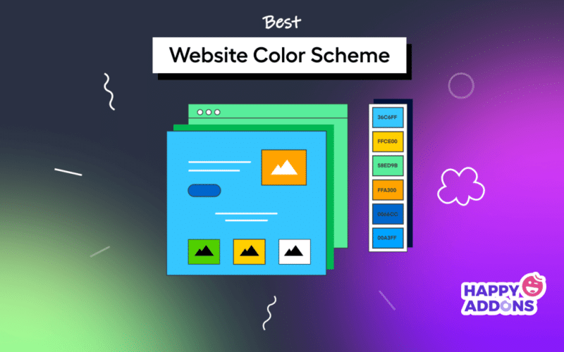
- Comprehensive Strategy: Use a mix of primary, secondary, and tertiary colors for a balanced design.
- Color Theory: Apply color theory to create harmonious and effective color combinations.
Using Colors for Conversion Rate Optimization

It’s not a novelty that colors are important in marketing. In advertising and branding, color has always been considered a central element. However, in conversion rate optimization (CRO), the role of colors takes on a more dynamic and immediate function.
In branding, colors are used to infuse personality into the brand and to elicit a certain response from the consumer. For example, black expresses sophistication and power and is associated with luxury products or high-tech electronics. Gold is associated with wealth and can be used to suggest a premium price—blue commands respect and authority.
But conversion optimization is more about efficiency and the present moment. CRO tactics are not aiming to create an impression; they are trying to get a practical response. Their mission is to immediately trigger a purchase, a lead, or another desired action. Therefore, the focus is on persuasive colors that can directly influence user behavior and drive conversions.
The Psychological Impact of Colors
Each color has its psychological impact that can affect how users interact with a website. Understanding the psychology of colors can help marketers choose the right hues to enhance conversion rates. For example
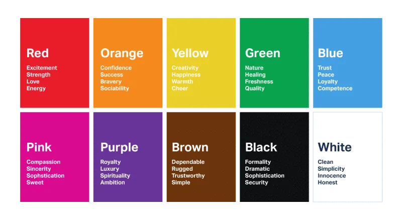
- Red: Known for its ability to capture attention, red is often used in clearance sales and urgency-related contexts. It’s a color that can evoke excitement and prompt quick decisions.
- Blue: Blue is associated with trust and dependability. It’s commonly used by financial institutions and healthcare providers to convey a sense of security and reliability.
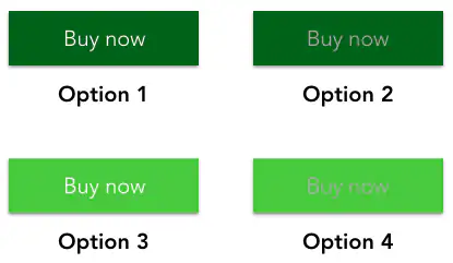
- Green: Green is linked to nature and tranquility, but it’s also the color of money, making it a good choice for financial-related calls to action. It’s a color that signifies growth and renewal.
- Yellow: This color exudes warmth and cheerfulness. It can grab attention without being as aggressive as red. Yellow can stimulate mental activity and generate a welcoming atmosphere.
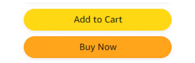
- Orange: Combining the energy of red and the happiness of yellow, orange is great for calls to action and subscriptions. It’s a color that signifies enthusiasm and creativity.
- Purple: Often associated with luxury and sophistication, purple can be used to create a sense of exclusivity and high quality.
Testing and Analyzing Colors for CRO
To determine which colors work best for conversion rate optimization, it’s essential to conduct A/B testing. By comparing the performance of different colors in the same context, marketers can gather data on what works best for their specific audience. For example, you can test different colors for your call-to-action buttons and measure which one gets the most clicks or conversions.
Furthermore, heat maps and user behavior analytics can provide insights into how users interact with different color elements on a page. These tools can show where users are clicking, how they are navigating the site, and which colors are drawing the most attention.
Cultural Considerations
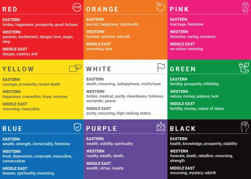
Cultural differences can significantly impact how colors are perceived. For instance, while white symbolizes purity and simplicity in many Western cultures, it represents mourning in some Eastern cultures. Therefore, it’s crucial to consider the cultural context of your target audience when selecting colors for CRO. This understanding can help in tailoring your website’s color scheme to resonate better with your audience and improve conversion rates.
Practical Tips for Using Colors in CRO

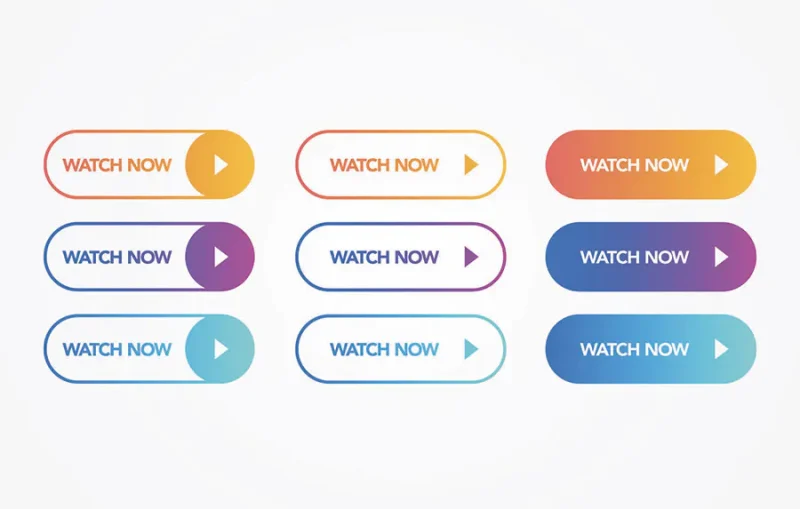
- Create Contrast: Ensure that your call-to-action buttons stand out by using contrasting colors. This can make the buttons more noticeable and encourage clicks.
- Consistency with Branding: While it’s important to choose colors that optimize conversion, they should also be consistent with your overall branding to maintain a cohesive look and feel.
- Highlight Key Areas: Use color to draw attention to key areas of your website, such as special offers, testimonials, or important information. This can guide users’ eyes to the most important parts of your page.
- Avoid Overloading: While colors are important, using too many can overwhelm users and reduce the overall effectiveness. Stick to a simple color palette that enhances usability and aesthetics.
Here are a Few Interpretations of Persuasive Colors
Colors play a critical role in shaping perceptions and influencing behavior, particularly in the context of online marketing and conversion rate optimization. Each color carries its own set of meanings and psychological associations that can impact how users interact with a website and make purchase decisions. Understanding these interpretations can help businesses select the right colors to enhance user engagement and drive conversions.
Black
- Power and Sophistication: Black is often associated with elegance, sophistication, and power. It is commonly used by luxury brands to convey a sense of exclusivity and high quality. Black can create a dramatic and bold impression, making it suitable for high-end products.
- Negative Connotations: On the downside, black can also signify opacity, the unknown, and the dark. It can evoke feelings of mystery or even intimidation if not used carefully.
White
- Clarity and Safety: White signifies purity, simplicity, and cleanliness. It is often used to create a sense of space and openness on a webpage. White backgrounds can make other colors and elements stand out more clearly.
- Achromatic Nature: While white is generally positive, it is also neutral and can sometimes come across as sterile or uninviting if overused.
Blue
- Calm and Serenity: Blue is the color of calmness and serenity. It is associated with trust, reliability, and professionalism. Many financial institutions and healthcare providers use blue to convey a sense of stability and dependability.
- Cool and Detached: However, blue can also be perceived as cold and unengaging. It may not evoke the same level of excitement or urgency as warmer colors.
Green
- Nature and Growth: Green symbolizes nature, growth, and renewal. It is a refreshing and energizing color that can evoke feelings of harmony and balance. Green is often used in environmental and wellness-related contexts.
- Money and Prosperity: In many cultures, green is also associated with money and prosperity, making it a good choice for financial products and services.
Red
- Attention and Excitement: Red is one of the most powerful colors for capturing attention. It is associated with excitement, energy, and urgency. Red can stimulate the senses and prompt quick decision-making, making it effective for call-to-action buttons and sale promotions.
- Aggression and Danger: On the flip side, red can also signify aggression, danger, and warning. It should be used judiciously to avoid overwhelming users.
Yellow
- Optimism and Creativity: Yellow is a bright, cheerful color that evokes feelings of happiness and optimism. It can stimulate mental activity and creativity. Yellow is often used to attract attention and create a sense of warmth and friendliness.
- Caution and Anxiety: However, too much yellow can cause visual fatigue and anxiety. It can also be associated with caution and warnings, similar to traffic signals.
Orange
- Fun and Happiness: Orange combines the energy of red and the warmth of yellow. It is associated with fun, enthusiasm, and excitement. Orange can create a lively and inviting atmosphere, making it effective for calls to action and promotions.
- Less Formal: While orange is engaging, it is less formal than colors like black or blue. It may not be suitable for more serious or professional contexts.
Purple
- Royalty and Luxury: Purple is often associated with royalty, luxury, and sophistication. It conveys a sense of elegance and exclusivity. Purple can create an impression of high quality and premium value.
- Mystery and Depth: Purple also bears connotations of mystery and depth. It can evoke feelings of intrigue and fascination, making it suitable for creative and artistic brands.
Practical Applications of Persuasive Colors
When implementing persuasive colors in web design, consider the following practical applications to maximize their impact:
Call-to-Action Buttons
These buttons serve as the gateway to conversions, making it imperative to choose colors that not only catch the eye but also evoke a sense of urgency or excitement. Colors like red or orange are known for their ability to prompt action, encouraging users to click and engage immediately. By strategically selecting hues that stand out against the rest of the page, you can guide users toward desired actions and enhance conversion rates.
Backgrounds and Layouts
The backdrop against which your content is presented plays a crucial role in shaping user experience. Opting for background colors that create a neutral and calming environment can help users focus on the content without distractions. Shades of white or light colors promote a clean and spacious feel, providing a visually appealing canvas for your website’s elements to shine. This minimalist approach fosters a sense of clarity and ease of navigation, ultimately improving user engagement.
Highlighting Key Elements
In a sea of information, it’s essential to draw attention to key elements that drive conversions, such as special offers, discounts, or vital information. Utilizing contrasting colors to highlight these elements ensures they stand out prominently, capturing users’ attention and guiding them toward the desired actions. By strategically employing color contrast, you can create a visual hierarchy and steer users toward the most critical parts of the page, facilitating decision-making and boosting conversion rates.
Consistency with Brand Identity
Your brand’s colors are its visual identity, representing its personality, values, and message. Ensuring consistency in color schemes across your website reinforces brand recognition and fosters trust with users. By aligning the colors used in call-to-action buttons, backgrounds, and other elements with your brand’s overall identity, you establish a cohesive visual language that resonates with your audience. This consistency not only strengthens brand recall but also enhances user experience, instilling confidence and loyalty in your brand.
The Role of Colors in Conversion Rate Optimization: Myths and Realities
Conversion rate optimization aims to lead more traffic to the ultimate goal: completing a purchase and generating a lead. The color of elements that visitors are navigating through can have a great impact on the visitor’s decision to follow a link or a call to action.
The truth is, when it comes to color, an elixir for the conversion rate does not exist. There is not a unique color that can invariably draw more conversions when used on any website. The call-to-action color is unique to every website and has to be integrated into the color scheme.
The only rule that applies is that the call to action button has to be highly visible. An eye-popping color can do the job. A great solution would be to create contrast for the call to action button by choosing a complementary color. Unconventional combinations of persuasive colors can also draw the attention of users.
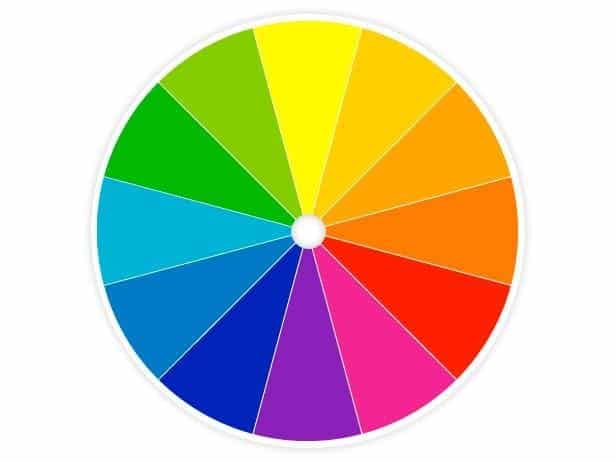
There is, however, a certain color theory that helps web designers find the perfect combination of colors to appeal to the user according to the website and company theme. Canvas color wheel in RGB (red, green, blue) style is ideal for online use, mixing light, much like on a computer or TV screen.
Real-World Examples of Persuasive Colors in Action
To better understand the impact of persuasive colors on conversion rates, let’s look at some real-world examples and case studies that demonstrate how different companies have effectively utilized colors to influence user behavior and drive sales.
Amazon's Use of Orange
Amazon is a prime example of a company that has mastered the use of persuasive colors to drive conversions. The online retail giant uses a bright orange color for its ‘Add to Cart’ button, which stands out against the predominantly white and blue background of the website. This high-contrast color choice grabs the user’s attention and encourages them to complete the purchase, contributing to Amazon’s high conversion rates.
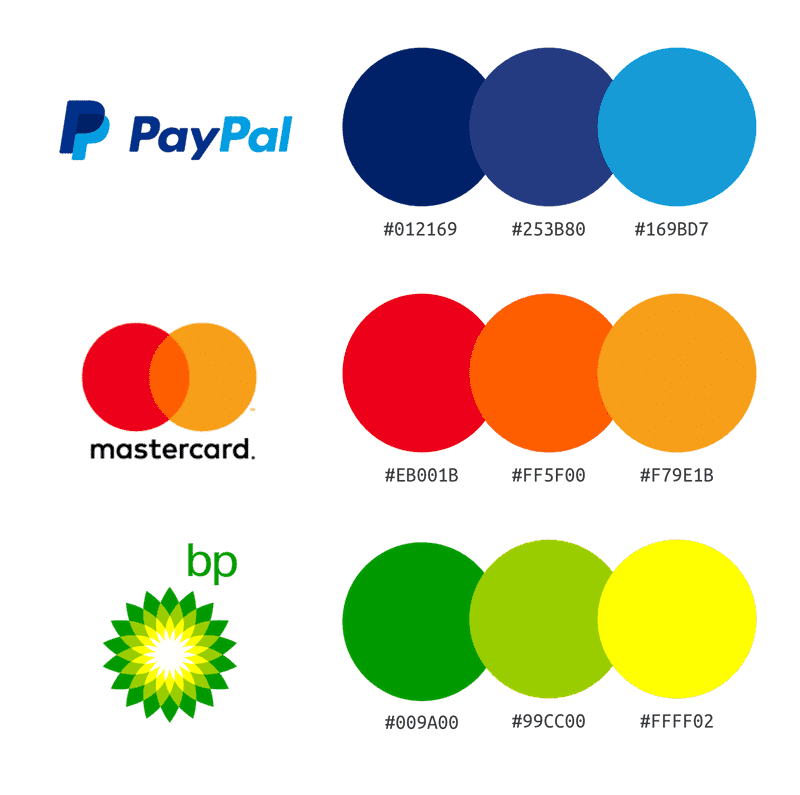
PayPal's Trust-Building Blue
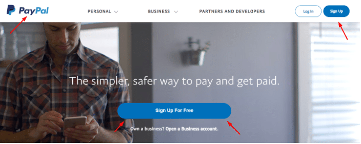
PayPal leverages the color blue extensively in its branding and web design. Blue is associated with trust, reliability, and security, which are crucial qualities for a financial service provider. By using blue in its call-to-action buttons, headers, and background elements, PayPal reinforces its brand values and builds trust with users, encouraging them to complete transactions with confidence.
HubSpot's Green for Growth
HubSpot, a leading marketing and sales platform, uses green for its primary call-to-action buttons. Green is the color of growth, nature, and renewal, aligning well with HubSpot’s mission to help businesses grow. The green buttons stand out on the page, making it easy for users to identify key actions such as signing up for a free trial or requesting a demo, ultimately boosting conversion rates.
Netflix's Red for Urgency
Netflix uses red, a color associated with excitement and urgency, for its ‘Join Now’ and ‘Sign In’ buttons. This choice of color aligns with the dynamic and entertaining nature of the platform. The red buttons are highly visible and prompt users to take immediate action, which is crucial for a subscription-based service that relies on quick sign-ups.
Insights and Best Practices
From these examples, several best practices emerge for using persuasive colors to enhance conversion rates:
- Understand Your Audience: Different colors resonate with different audiences. Research your target demographic to understand which colors are most likely to influence their behavior.
- Create Contrast: Ensure that call-to-action buttons and key elements stand out by using high-contrast colors. This makes it easier for users to identify and interact with important elements.
- Align with Brand Identity: While it’s important to choose colors that optimize conversions, they should also be consistent with your overall brand identity to maintain a cohesive look and feel.
- Test and Iterate: Conduct A/B testing to determine which colors perform best for your specific audience and context. Use data and analytics to make informed decisions about color choices.
By studying real-world applications and best practices, businesses can gain valuable insights into how to use persuasive colors effectively to drive conversions and achieve their marketing goals.
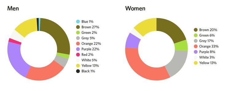
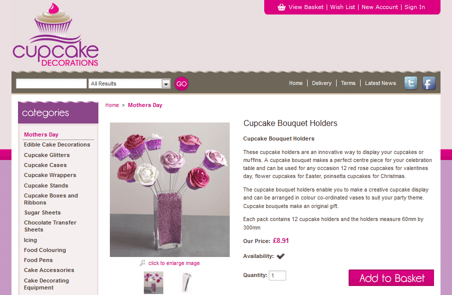
Here are Two Similar E-shops
Funkymuffin.co.uk and Cupcakedecoration.co.uk have similar dominant persuasive colors but have chosen very different colors for their calls to action.

Conversion optimization has another important ally in deciding the best persuasive colors: A/B tests. Thanks to them you can clearly see which color inspires the desired action. It’s all done in real time, on real customers, so it’s the best proof for your color hypothesis.
How Colors Affect Conversions
Case Study 1: Heinz Ketchup Bottle Color
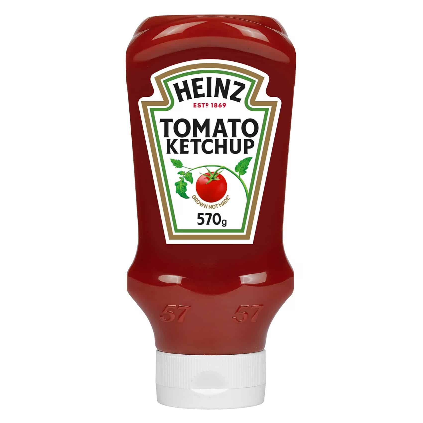

In a remarkable experiment, Heinz undertook a bold change by altering the color of their sauce from red to green. The results were nothing short of astonishing. Surpassing all expectations, the green-hued sauce flew off the shelves, selling out rapidly. In a testament to the power of perception, approximately 7 million units were sold, leading to a staggering $23 million increase in revenue.
The shift from red to green triggered a profound psychological response among consumers, who associated the new color with healthiness and freshness. This perception, fueled by the vibrant green hue, created a newfound appeal for the sauce, driving unprecedented demand. Heinz’s success story underscores the profound impact that color can have on consumer perception and purchasing behavior, showcasing how a simple color change can lead to extraordinary business outcomes.
Case Study 2: CTA Button Colors

In a comprehensive testing initiative involving over 600 subjects, Dmix made a fascinating discovery: conversions surged by an impressive 34% when they replaced their previous green call-to-action button with a bold red alternative. This significant uplift in conversions underscored color choice’s profound impact on user engagement and decision-making.
Similarly, Performable experienced a remarkable 21% increase in conversions simply by switching their call-to-action button from green to red. These real-world examples highlight the potency of color psychology in driving consumer behavior and influencing purchase decisions.
With a 34% increase in conversions, the superiority of red buttons becomes evident, marking a clear victory in the color competition. The principle of leveraging contrast for maximum impact further underscores the importance of strategic color selection.
By choosing a color that opposes the dominant hue on the color wheel, brands can optimize visual appeal and ensure their call-to-action buttons command attention and drive conversions effectively. This strategic approach exemplifies how thoughtful color choices can yield significant returns in conversion rate optimization efforts.
FAQs
How can I determine which colors will be most effective for my website's conversion rate?
To determine the most effective colors for your website’s conversion rate, conduct A/B testing with different color schemes for call-to-action buttons and other key elements. Analyzing user behavior through heat maps and user analytics can also provide insights into which colors attract the most engagement. Additionally, consider your brand identity and target audience preferences when selecting colors.
Are there any colors that should generally be avoided in web design for conversion optimization?
While there are no hard and fast rules, some colors might generally be less effective or even counterproductive in web design for conversion optimization. For example, overly bright or neon colors can cause visual fatigue, while colors like red might be seen as aggressive or alarming if not used appropriately. It’s crucial to test and see what works best for your specific audience and context.
How do cultural differences impact the effectiveness of colors in conversion rate optimization?
Cultural differences can significantly impact how colors are perceived and their effectiveness in conversion rate optimization. For instance, white is associated with purity in Western cultures but with mourning in some Eastern cultures. Understanding the cultural context of your target audience is essential when choosing colors to ensure they evoke the desired emotional response and drive conversions.
Can the color of text on my website also influence conversion rates?
Yes, the color of text on your website can influence conversion rates. Readable and high-contrast text colors enhance the user experience by making content easy to read. For call-to-action text, using a color that contrasts with the background and surrounding elements can draw attention and encourage clicks. It’s important to balance aesthetics with functionality to maintain an effective design.
What role do secondary and tertiary colors play in web design and conversion optimization?
Secondary and tertiary colors play a supportive role in web design and conversion optimization. They are used to complement primary colors and create a cohesive and visually appealing design. These colors can highlight less critical information, guide users through the site, and maintain visual interest without overwhelming the primary call-to-action elements. Using a well-thought-out color scheme that includes secondary and tertiary colors can enhance the overall user experience and contribute to higher conversion rates.
What colors make people want to buy?
Colors that often encourage purchases include:
- Red: Grabs attention and creates a sense of urgency.
- Blue: Builds trust and security, often used by banks and businesses.
- Green: Associated with health, tranquility, and money, often used in stores to relax customers.
- Orange: Considered aggressive, creates a call to action; subscribe, buy, or sell.
- Black: Conveys luxury and sophistication, commonly used for high-end products.
- Yellow: Captures attention and is associated with optimism, used to attract window shoppers.