


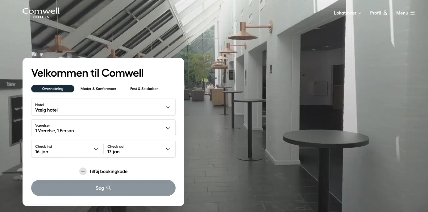
What is “Above the Fold”?
The term “above the fold” refers to the portion of a web page that is visible to users without scrolling when the page first loads. It includes everything displayed within the viewport, such as the header, navigation bar, and hero section, depending on the screen size. On mobile devices, “above the fold” encompasses the smaller area visible on the user’s screen before scrolling.
The fold is the bottom edge of this initial view. Anything below that line requires scrolling and is considered “below the fold.”
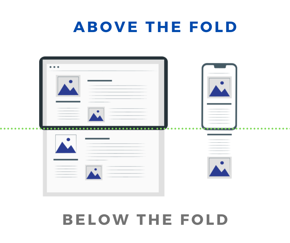
Image source: Marketingtracer
For example, on a desktop, “above the fold” might show the website’s logo, navigation menu, and a prominent call-to-action (CTA). On mobile, it might include a header banner and part of the hero image. The exact placement of “the fold” depends on the user’s device and screen resolution, which has made it a fluid concept in modern web design.
Mobile Versus Desktop
The concept of “above the fold” varies significantly between mobile and desktop due to differences in screen size, resolution, and user behavior. While the primary goal—delivering the most important content first—remains the same, the strategies for optimizing this visible area differ for each platform.
On an average desktop screen, the fold typically falls around 1200 pixels in height, providing more vertical and horizontal space to display key content. This allows designers to include multiple elements, such as headlines, subheadings, CTAs, and images, all visible without scrolling.
On mobile devices, the fold is generally much lower, often around 600 pixels in height, with far less width available. This limited space requires prioritizing simplicity and clarity, ensuring that only the most critical information is shown upfront. Mobile designs often embrace scrolling as an integral part of the user experience, while desktops aim to present more content “at a glance.”
We will take a look at this point more in-depth later in this post.
The Origins of “Above the Fold”
The term originates from print media, specifically newspapers. In the print world, “above the fold” referred to the top half of a folded newspaper that was immediately visible to customers at newsstands. Editors strategically placed headlines, eye-catching images, and primary content “above the fold” to grab attention and increase sales.
This concept transitioned seamlessly into the digital age, where the fold line represents the point at which users must scroll to access additional content. The idea remains the same: prioritize the most important elements—such as the primary CTA or critical messaging—in the area users see first.
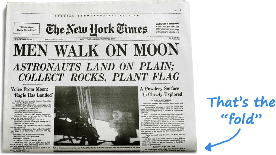
Image source: Epic Nine
The Importance of “Above the Fold” in Web Design
In today’s digital landscape, “above the fold” plays a vital role in user experience (UX) and conversion optimization. Research shows that users often decide within seconds whether to stay on a page or leave, making the content above the fold crucial for engaging visitors and guiding them toward desired actions.
Key Reasons Why It Matters:
- First Impressions: Visitors often form opinions about a website within 0.05 seconds. A well-designed “above the fold” section can capture their attention instantly.
- Critical Messaging: Placing your core message, value proposition, or top-fold CTA here ensures that users don’t miss your most important content.
- Mobile Experience: On mobile devices, where screen space is limited, the scroll threshold determines what users focus on first. Ensuring clarity and appeal in this area is critical.
While the importance of “above the fold” remains significant, it’s worth noting that scrolling behavior has evolved with time. Modern users are more likely to scroll, but the hero section and content above the fold still serve as an essential gateway to deeper engagement.
Why Above the Fold Matters in User Experience (UX) and CRO
The “above the fold” section plays a crucial role in shaping how users interact with a website. It directly influences their perception, engagement, and behavior. In the competitive digital landscape, where attention spans are short and expectations are high, the design and content of this visible area can make or break the success of a website. It serves as the first point of contact and sets the tone for the user experience, making it a priority for both UX designers and CRO specialists.
Attention Spans and First Impressions

Users are known to form an opinion about a website within 2.6 seconds, according to a study. This means that the content above the fold is often the deciding factor in whether users engage further or bounce off the page. The design, messaging, and layout must therefore deliver instant clarity and appeal.
A strong first impression relies on three primary factors: visual design, content clarity, and loading speed. For example, a bold and concise headline paired with a clean, visually appealing hero section immediately draws attention and sets the tone for the rest of the page. If this area is cluttered, unclear, or slow to load, users are likely to lose trust and leave, impacting your bounce rate and conversions.
Elements such as a clean layout, a compelling headline, and a clear call-to-action (CTA) help users quickly understand the website’s purpose. For example, an e-commerce website might use this space to showcase a hero image of their latest product, accompanied by a brief description and a “Shop Now” button. Additionally, fast loading speeds are essential, as research shows that 53% of mobile users leave a site that takes more than three seconds to load.
The Correlation Between Fold Design and Bounce Rates
The design of the “above the fold” section plays a critical role in reducing bounce rates—the percentage of visitors who leave a site after viewing just one page. However, the success of this area isn’t just about cramming everything important into a limited space. Instead, it’s about empathizing with the user and creating a welcoming experience that invites them to continue exploring.
Joanna Wiebe from Copy Hackers emphasizes that trying to fit everything above the fold can backfire. She notes, “Don’t cram everything above the fold. Visitors are willing to scroll… as long as they know there’s something to scroll down for.” This highlights the importance of guiding users by providing visual or contextual cues that suggest there’s valuable content waiting for them below.
For example, if a landing page has too much information crammed into the fold, users may feel overwhelmed and leave. On the other hand, a well-designed fold with a clear value proposition and a visually appealing layout entices users to stay, engage, and scroll further. Effective above-the-fold design serves as a hook that encourages deeper interaction, helping reduce bounce rates and improve session duration.
Impact on Conversions: Statistics and Insights
The “above the fold” section plays a pivotal role in driving conversions, as it is often the first and most prominent part of a webpage that users interact with. Data consistently shows that this area commands the majority of user attention and directly influences their behavior. However, understanding how users interact with the fold requires a nuanced approach that considers visual hierarchy, content relevance, and scrolling behavior.
According to a study by the Nielsen Norman Group, 57% of viewing time is spent on content above the fold. This highlights the importance of strategically placing critical elements—such as headlines, CTAs, and value propositions—where they are most likely to be seen. The same study also found that users spend 74% of their viewing time on the first two screenfuls of content, reinforcing the need for compelling design and messaging not just above the fold but slightly below it as well.
Heatmaps have also revealed that 80% of user attention remains focused on the content above the fold, but the remaining 20% below the fold is not insignificant. This data underscores that while the above-the-fold area should be optimized for engagement, designers must also ensure the content below the fold supports and builds on the initial impression to encourage scrolling and interaction.
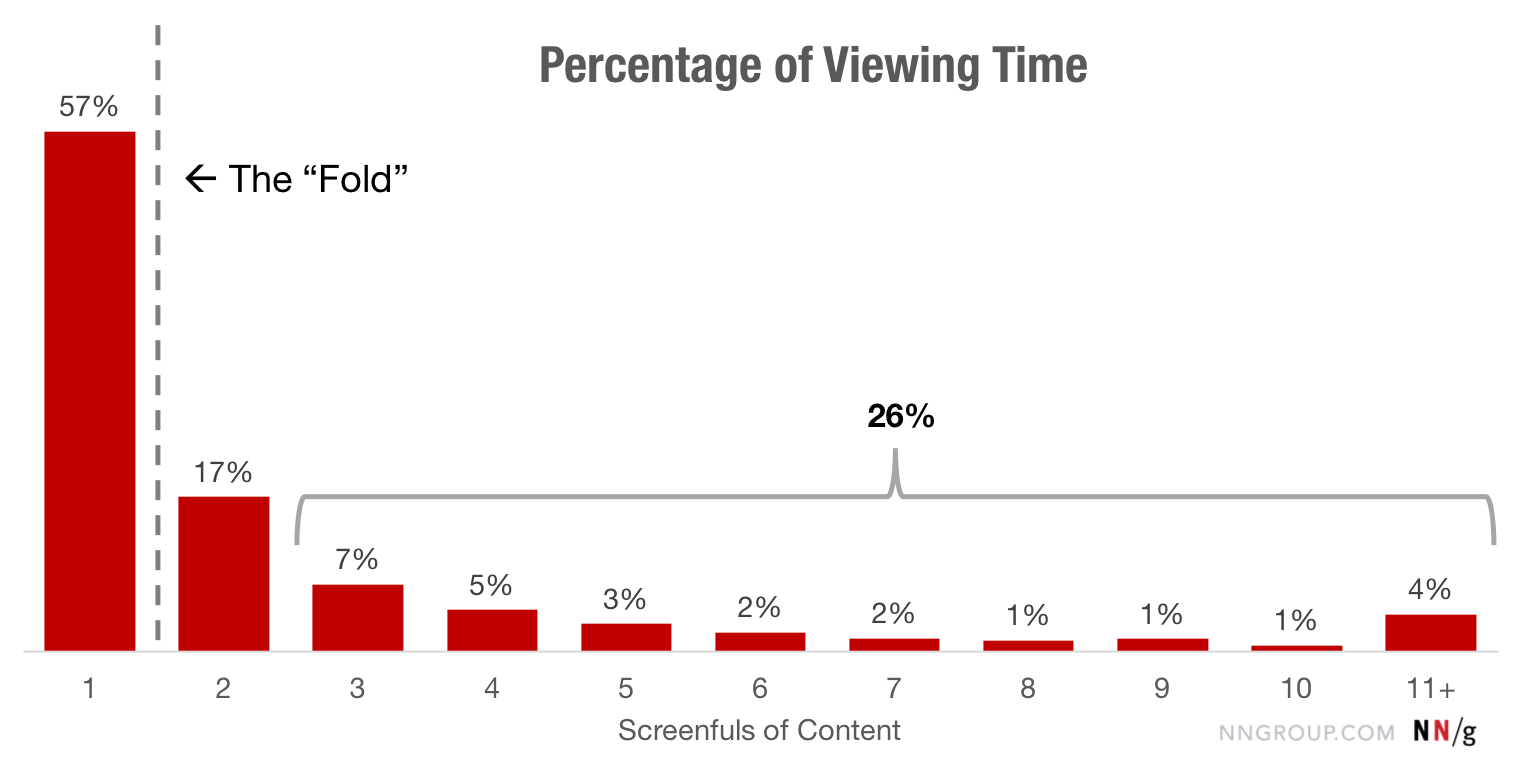
Image source: Nielsen Norman Group
More Insights from Data-Driven Studies
- The Fold Encourages Engagement:
When users are presented with clear and visually appealing elements above the fold, they are more likely to engage with the page and scroll further. For example, pages with visually striking hero sections, attention-grabbing headlines, and concise CTAs often experience lower bounce rates and higher time-on-page metrics. - Trust Elements Boost Conversions:
Placing trust signals above the fold, such as logos of well-known brands, security badges, or customer testimonials, increases user confidence. This is especially crucial for e-commerce sites, where trust-building elements have been shown to improve conversion rates by up to 42%. - Scroll Behavior and Context Matter:
While users are willing to scroll, they need a reason to do so. The Nielsen Norman Group emphasizes that the design above the fold should act as a preview of what’s to come, offering just enough information to spark curiosity. Websites that hint at additional valuable content below the fold tend to see higher engagement levels. - Content Placement Impacts Interaction:
The study also highlights that primary CTAs placed above the fold often outperform those placed further down. However, for more complex offers or products requiring user education, CTAs placed slightly below the fold, after key benefits or explanations, can result in better conversion rates.
Why It Matters for CRO and UX Design
In CRO, the goal is to optimize every aspect of a website to convert visitors into customers. The above-the-fold section is one of the most visible and impactful areas to achieve this. A well-designed fold guides users to take immediate action, whether that’s clicking a CTA, signing up for a newsletter, or exploring a product page.
From a UX perspective, the fold is about creating a seamless and engaging experience that captures users’ interest and motivates them to interact with the content. By focusing on user intent and delivering value upfront, businesses can create a better overall experience that encourages retention and loyalty.
When done right, the above-the-fold area becomes the centerpiece of a website’s success, driving higher engagement, lower bounce rates, and improved conversions.
The Anatomy of an Effective Above the Fold Section
A well-designed “above the fold” section is the cornerstone of a high-performing webpage. It’s the area where users form their first impressions, decide whether to stay or leave, and interact with your most important content. The key to an effective design lies in prioritizing essential elements, balancing visual and textual content, and maintaining a clean, inviting layout. Below, we break down the critical components of an effective above-the-fold section and share best practices for creating layouts that engage and convert.
Headlines: The Hook That Captures Attention
The headline is arguably the most important element above the fold. It’s the first thing visitors will read, and it determines whether they’ll stay on the page or leave. A great headline acts as a hook that immediately grabs attention while clearly communicating the core message or value proposition.
For headlines to be effective, they need to be benefit-focused and written with the audience in mind. Instead of generic statements, opt for headlines that answer the user’s unspoken question: What’s in it for me? For example, instead of saying “We Offer Digital Marketing Services,” a stronger headline would be “Get 300% More Leads with Our Proven Marketing Strategies.” This headline focuses on a specific outcome that appeals directly to the user’s goals.
Masterclass is a good example of a headline that delivers value:

Using proven headline formulas can also help make your messaging more engaging. For example:
- The How-To Formula: “How to Boost Your Website Conversions in Just 30 Days”
- The Curiosity Formula: “What 90% of Businesses Don’t Know About CRO (And How It’s Costing Them)”
- The Promise Formula: “Double Your Sales Without Spending More on Ads”
Headlines should also work in conjunction with supporting subheadings to clarify or reinforce the primary message. Keep headlines short, impactful, and easy to read, ensuring they grab attention within seconds.
Hero Images: The First Visual Impression
The hero image is the visual centerpiece of the above-the-fold section and sets the tone for the entire page. Whether it’s a static image, video, or animation, a strong hero image reinforces the headline and helps users understand the purpose of the website within seconds.
Hero images should be relevant to your product or service while evoking an emotional response. For example, an e-commerce site selling outdoor gear might use a hero image of a happy camper surrounded by scenic nature, showcasing the product in its ideal context. Similarly, a SaaS company might use a clean, illustrative graphic that represents its software interface.

A key aspect of hero image design is ensuring it doesn’t overpower the text or other elements. The image should complement the headline and CTA rather than compete with them for attention. Avoid overly cluttered visuals and instead focus on simplicity and clarity. Hero images should also be optimized for performance, as slow-loading visuals can lead to user frustration and increased bounce rates.
For mobile users, consider scaling down the hero image and focusing more on delivering a message that fits within the smaller screen space. Ensure the image works seamlessly across different devices and resolutions.
Call-to-Actions (CTAs): The Driving Force Behind Engagement
CTAs are the action-oriented elements of the above-the-fold section, designed to guide users toward a specific goal, whether it’s signing up, purchasing, or learning more. The placement and wording of CTAs can significantly influence conversion rates, making them one of the most critical components of the fold.
For CTAs to be effective, they need to be clear, direct, and enticing. For example, instead of a generic CTA like “Submit,” use something more specific and action-oriented, like “Get Your Free Trial Now” or “Claim Your Discount Today.” These CTAs not only communicate the desired action but also highlight the benefit of taking that action.
Placement is also key. A CTA should be immediately visible and easy to click, whether on desktop or mobile. Most CTAs are placed directly below the headline or hero image for maximum visibility. The design of the button itself is equally important—use contrasting colors to make it stand out, and ensure the text is large and readable. On mobile, ensure there is adequate spacing around the CTA so it’s easy to tap without accidentally clicking other elements.
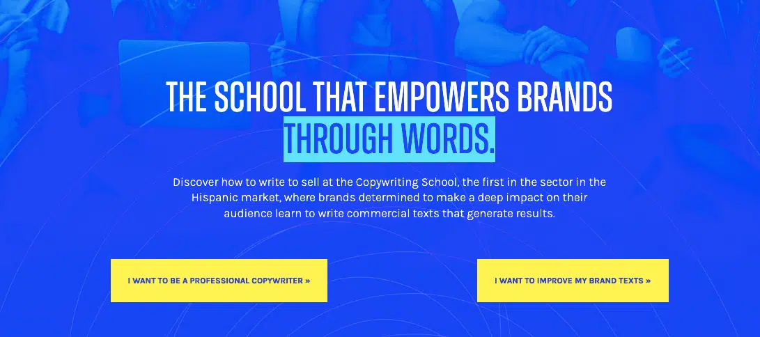
Copywriting School is a great example of CTAs that are clear, non-generic, and that deliver immediate value:
Navigation Bar: Simple, Functional, and Accessible
The navigation bar plays a supporting role above the fold by providing users with access to other areas of the website. While it’s not the main focus, a well-designed navigation bar can enhance usability and ensure a smooth browsing experience.
For best results, keep the navigation bar minimal, featuring only the most essential links (e.g., Home, About, Products, Pricing, Contact). The logo should be positioned intuitively, typically in the top-left corner, allowing users to identify the brand immediately. Sticky navigation bars, which remain visible as users scroll down, can further enhance usability, especially on longer pages.
On mobile devices, space is limited, so a hamburger menu is often used to keep the design clean and uncluttered while still providing easy access to navigation options.
Balancing Text and Visuals
An effective above-the-fold design achieves a harmonious balance between textual and visual elements. Overloading the area with too much information can overwhelm users, while an overly minimalist approach may fail to communicate the core message.
White space is a crucial design element that ensures text and visuals have room to breathe. It helps improve readability and directs the user’s focus to the most important elements, such as the headline or CTA.
The color scheme also plays a significant role in creating a visually appealing fold. Use colors that align with your brand identity while maintaining high contrast between text, background, and CTAs to ensure all elements are easily distinguishable.
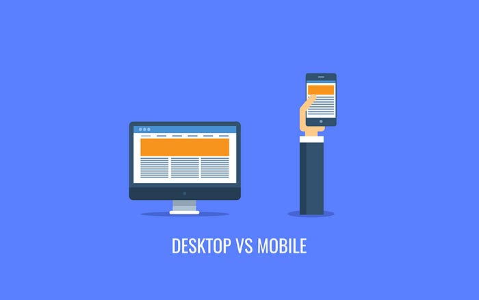
Desktop vs Mobile: Differences in Above the Fold Design
The way users experience the “above the fold” section varies significantly between desktop and mobile devices. These differences stem from varying viewport sizes, scroll behaviors, and interaction methods. Designing an effective above-the-fold section for both platforms requires careful consideration of these factors, as well as a responsive design approach that adapts content seamlessly across devices. Let’s explore the differences and best practices for structuring above-the-fold content for desktop and mobile screens.
Viewports and Screen Space
The most obvious difference between desktop and mobile lies in viewport size. On desktop screens, the fold typically falls around 1200 pixels in height, offering significantly more horizontal and vertical space. This extra room allows designers to present multiple elements side by side, such as a headline, hero image, and CTA, creating a visually rich layout that delivers maximum impact above the fold.
Mobile devices, on the other hand, have a much smaller viewport, with the fold usually falling at 600 pixels or less in height. The narrower width also restricts the amount of horizontal space available, forcing designers to stack content vertically. As a result, mobile layouts often prioritize simplicity, focusing on one core element—such as a headline or CTA—while guiding users to scroll for more information.
| Device Type | Typical Viewport Width | Typical Viewport Height (Fold) | Notes |
|---|---|---|---|
| Desktop | 1200–1920 pixels | ~1200 pixels | Allows horizontal layouts with multiple elements side by side. |
| Laptop | 1024–1440 pixels | ~768–900 pixels | Smaller than desktop but still supports side-by-side layouts effectively. |
| Tablet (Portrait) | 768 pixels | ~1024 pixels | Vertical space increases, often used for slightly simpler layouts. |
| Tablet (Landscape) | 1024 pixels | ~768 pixels | Horizontal layouts are possible, but space is more limited than laptops. |
| Mobile | 320–414 pixels | ~600 pixels or less | Requires vertical stacking due to narrow width; focus on core elements. |
For example, an e-commerce site on a desktop might feature a hero image of a product, a headline, a subheading, and a “Shop Now” button all visible above the fold. On mobile, the same site might display just the product image and CTA, with supporting content moved below the fold.
Scroll Behavior and User Interaction
User interaction also varies significantly between desktop and mobile, influencing how the above-the-fold section is designed.

Image source: Pennington Creative
On desktop, users interact with the page using a mouse or trackpad, which allows for quick navigation and hovering over interactive elements like menus or buttons. Scrolling is often a secondary behavior; users tend to assess the above-the-fold content first before deciding whether to scroll further. This makes it critical to provide enough information above the fold to capture attention while still hinting at additional content below.
On mobile, scrolling is a more intuitive and natural behavior, thanks to touchscreen interfaces. Users are more likely to swipe down instinctively to explore the page, meaning that the above-the-fold section serves as a teaser rather than a complete informational block. For example, partially visible text or images below the fold can encourage users to scroll and discover more content.
Mobile-First vs Desktop-First Design
The design process often begins with a mobile-first or desktop-first approach, depending on the target audience and use case.
- Mobile-First Design: This approach prioritizes the smaller screen by focusing on essential content and ensuring simplicity. Once the mobile layout is finalized, additional elements are added to the design for larger screens. Mobile-first design is particularly effective for industries where the majority of traffic comes from mobile users, such as e-commerce or social media platforms.
- Desktop-First Design: This approach starts with the larger screen, allowing designers to create more complex layouts with multiple elements above the fold. The design is then scaled down for mobile, simplifying or reorganizing content as needed. Desktop-first design works well for B2B websites or industries where users tend to access content from workstations.
Responsive Design: Adapting Across Devices
A responsive design approach ensures that the above-the-fold section looks and functions optimally on any device, regardless of screen size or resolution. This is achieved through techniques like media queries, breakpoints, and adaptive layouts.
For example, a responsive hero section might display a full-width background image on desktop, but crop or resize the image for mobile to maintain focus on the most relevant part of the visual. Similarly, font sizes and button dimensions should adjust dynamically based on the viewport, ensuring readability and usability on all devices.
Key Tips for Responsive Above-the-Fold Design
- Content Stacking on Mobile: Since mobile screens prioritize vertical layouts, stack content in a logical order, with the headline and CTA appearing first. Supporting elements, such as subheadings or secondary images, can follow below.
- Touchpoint Size: On mobile, ensure buttons and links are large enough to be tapped easily, with adequate spacing to prevent accidental clicks. The ideal size for touch targets is at least 48px by 48px, as recommended by Google.
- Font Hierarchy: Use scalable font sizes that remain legible across devices. Headlines should be prominent, while subheadings and body text should scale appropriately for smaller screens.
- Horizontal vs Vertical Space: Take advantage of the wider screen on desktop to display side-by-side layouts, but switch to vertical stacking on mobile for a cleaner look.
- Test Across Devices: Responsive design requires thorough testing on multiple devices and browsers to ensure a consistent and enjoyable user experience. Tools like BrowserStack or Google’s Mobile-Friendly Test can help identify any design issues.
Common Mistakes to Avoid in “Above the Fold” Design
Creating an effective “above the fold” section is crucial for engaging users, but even the best intentions can result in common design mistakes that harm user experience, increase bounce rates, and reduce conversions. These errors often stem from poor prioritization, lack of responsiveness, or failure to test designs thoroughly. In this section, we’ll explore the most frequent mistakes in above-the-fold design and how to avoid them to ensure your website creates the best first impression.
Overloading the Top Section with Images or Text
One of the most common mistakes in above-the-fold design is overcrowding the space with too many visual or textual elements. Trying to fit everything “important” into the top section often leads to design clutter, making it difficult for users to focus on the main message or CTA.
When there’s too much going on above the fold, visitors may feel overwhelmed and leave the page. For instance, combining multiple images, lengthy blocks of text, and numerous CTAs can confuse users and dilute the purpose of the page. Instead of enticing visitors to explore further, an overloaded fold can drive them away.
To avoid this, prioritize visual hierarchy by focusing on one main element, such as a strong headline or a visually appealing hero image. Supporting elements, like subheadings or secondary CTAs, can be placed strategically below the fold or integrated subtly into the design. Leveraging white space can also help improve clarity and direct the user’s attention to key areas.

Using Non-Responsive Images
Non-responsive images are a major design flaw, especially in today’s mobile-first world. Images that look great on desktop but don’t scale properly for smaller devices can disrupt the layout, cut off important visual elements, or even slow down page loading times.
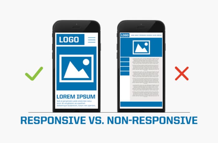
Image source: Innoraft
For example, a large hero image that isn’t optimized for mobile may take too long to load, frustrate users, and cause them to abandon the page entirely. Similarly, cropping issues can result in important parts of the image being cut off on smaller screens, making the design appear sloppy and unprofessional.
To prevent this, use responsive images that adjust dynamically to different screen sizes using media queries. Optimize images for speed by compressing them and employing techniques like lazy loading, which ensures images load only when they come into the user’s viewport.
Poor CTA Placement
The placement of the call-to-action (CTA) is one of the most important decisions in above-the-fold design, yet it’s often mishandled. CTAs that are too far off to the side, buried in a cluttered layout, or simply not visible above the fold can result in missed opportunities for engagement.
Another common mistake is placing the CTA too early, before the user has had a chance to understand the page’s value proposition. For example, placing a “Sign Up Now” button in the hero section without any supporting context or explanation may come across as pushy, especially for users unfamiliar with the product or brand.
Instead, ensure the CTA is clearly visible and easy to interact with. Place it in a prominent location, such as below the headline or hero image, where it naturally catches the user’s eye. For more complex offers, consider delaying the CTA until users have scrolled and absorbed more context. A/B testing different CTA placements and designs can help determine what resonates best with your audience.

Ignoring Mobile Testing and Optimization
Many above-the-fold designs still prioritize desktop layouts, resulting in poor experiences for mobile users. This oversight can lead to non-mobile-friendly banners, improperly scaled fonts, or misplaced CTAs that are difficult to tap on smaller screens.
For example, a navigation bar that works well on a desktop might crowd the above-the-fold space on mobile, pushing key content below the fold and making it less effective. Additionally, elements designed for desktop interactions, like hover effects or large dropdown menus, may not translate well to mobile touchscreens.
To avoid these issues, adopt a mobile-first design approach, where layouts are initially designed for smaller screens and then scaled up for desktops. Conduct thorough mobile testing to identify and fix issues like overlapping text, misaligned elements, or CTAs that are too small to tap. Tools like Google’s Mobile-Friendly Test can provide valuable insights into how your site performs on different devices.
Neglecting Page Speed and Loading Times
Slow loading times can have a devastating impact on the effectiveness of the above-the-fold section. If users have to wait for large images, videos, or animations to load, they’re likely to abandon the page before even seeing its content. According to Google, 53% of mobile users leave a site that takes longer than three seconds to load.
Heavy background images or videos are often the culprits behind slow loading times. While these elements can be visually impressive, they must be optimized to ensure they don’t negatively impact performance.
To address this, compress images and use modern formats like WebP, which offer high quality at smaller file sizes. Use lazy loading for below-the-fold content to prioritize above-the-fold elements. Additionally, make use of content delivery networks (CDNs) to ensure faster loading times across different regions.
Visual Hierarchy and User Flow Above the Fold
An effective visual hierarchy is the foundation of a well-designed “above the fold” section. It ensures that users are guided through the most important elements in the order that aligns with your website’s goals, whether that’s capturing attention, communicating value, or driving conversions. By strategically arranging content using size, color, alignment, and contrast, designers can create a user flow that directs attention where it’s needed most, all within the split seconds it takes for a visitor to form an impression.
Visual hierarchy isn’t just about aesthetics—it’s about creating a seamless user experience (UX) that naturally leads visitors toward the intended action, like clicking a CTA or scrolling for more information.
The Role of Typography in Visual Hierarchy
Typography is one of the most powerful tools for creating visual hierarchy. By varying the size, weight, and placement of text elements, designers can clearly communicate the importance of each piece of information.
Headlines are often the largest and most prominent text on the page, making them the first thing users notice. A bold and well-crafted headline immediately grabs attention and conveys the central message of the page. Supporting text, such as subheadings or body copy, should be smaller and lighter to maintain a clear distinction between primary and secondary content. For example, a headline might use a 40px font size, while subheadings are sized at 20px and body text at 16px, creating a natural flow for the reader.
Alignment also plays a critical role in typography. Center-aligned text is often used for headlines in hero sections to draw focus, while left-aligned body copy improves readability, especially on larger desktop screens. When combined with consistent spacing and font hierarchy, these elements create a polished and easy-to-navigate design.
| Typography Element | Purpose | Font Size (Example) | Font Weight | Best Practices |
|---|---|---|---|---|
| Headline | Captures attention and communicates the main message. | 36–48px (desktop), 24–30px (mobile) | Bold or Extra Bold | Use concise, benefit-driven language and ensure strong contrast with the background. |
| Subheading | Provides supporting context to the headline. | 20–28px (desktop), 16–20px (mobile) | Regular or Semi-Bold | Keep it short and use it to elaborate on the headline’s key message. |
| Body Text | Delivers detailed information or secondary content. | 14–18px | Regular | Prioritize readability with clean, left-aligned text and adequate line spacing. |
| CTA Text | Guides users toward action (e.g., “Sign Up”). | 16–20px (desktop), 14–16px (mobile) | Bold or Semi-Bold | Use action-oriented language and a color that contrasts with the button background. |
| Navigation Text | Helps users navigate the site. | 12–16px | Regular or Semi-Bold | Keep it minimal and ensure it’s easily clickable or tappable, especially on mobile. |
Directing Attention with Color and Contrast
Color and contrast are vital tools for guiding users’ gaze and emphasizing important elements above the fold. By using contrasting colors for key elements, such as CTAs, designers can draw attention to specific actions without overwhelming the user.
For instance, a brightly colored CTA button against a neutral or white background will naturally stand out, ensuring that users don’t miss it. Contrast can also be used to highlight the most important text. For example, a light headline on a dark background ensures readability and prominence.
However, it’s important to use color strategically. Overusing bold or bright colors can create visual noise and dilute the impact of key elements. A carefully selected color palette—consistent with the brand’s identity—ensures harmony while maintaining emphasis on focal points.
Eye-Tracking Studies and Visual Flow
Eye-tracking studies provide valuable insights into how users interact with content above the fold. Research shows that users tend to follow predictable visual patterns when scanning a webpage, such as the F-pattern or Z-pattern. Understanding these patterns allows designers to place critical elements, like headlines, CTAs, and hero images, in positions where they’re most likely to be seen.
For example, in an F-pattern, users begin by reading the top of the page horizontally (often focusing on the headline), then scan down the left side of the page, occasionally moving horizontally when something catches their eye. A website following this pattern might place a strong headline at the top, a subheading to the left, and a prominent CTA further down the left side.
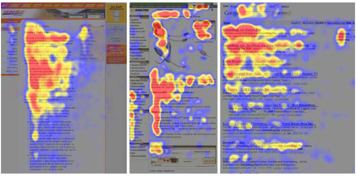
Image source: Eyequant
In contrast, the Z-pattern is common for pages with a more balanced layout, such as landing pages. Users’ eyes move horizontally across the top of the page (e.g., from the logo to the navigation bar), then diagonally down to a focal point (like a hero image or headline), and finally horizontally across the bottom. Placing a CTA at the bottom-right corner of this flow capitalizes on the natural scanning behavior.
Content Hierarchy in Layout Design
The layout of the above-the-fold section is another essential aspect of creating an effective visual hierarchy. Properly organizing elements ensures that users can quickly understand what the page is about and take action without feeling overwhelmed.
For example, the hero section is typically the most visually dominant part of the layout, featuring a large image or background paired with a headline and CTA. Below the hero section, supporting elements like subheadings or trust badges can provide additional context while staying secondary to the main content.
White space is crucial here. By leaving empty space around key elements, designers can reduce visual clutter and direct attention to the most important parts of the page. White space also improves readability and creates a sense of balance, making the layout feel less overwhelming.
The Importance of Fold Framing
“Fold framing” refers to how the design guides users’ focus toward specific areas of the page. Above the fold, this often involves placing primary elements, like headlines and CTAs, at the center or slightly above the center of the viewport, where they’re most visible. For mobile devices, fold framing might involve stacking content vertically, with the headline and CTA occupying the first screenful of content.
Using visual cues, such as arrows, partial text, or images that extend below the fold, can encourage users to scroll further. These subtle indicators create a sense of curiosity and continuity, inviting users to explore the rest of the page without feeling forced.
Examples of Effective Visual Hierarchy Above the Fold
Monday.com
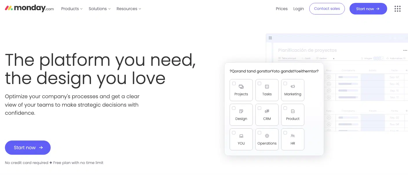
Monday.com showcases strong visual hierarchy by emphasizing its headline: “The Platform You Need, The Design You Love.” The CTA button, “Start Now,” is highly visible with a bold contrasting color. The hero image—a preview of the platform’s dashboard—offers a glimpse into the product’s functionality. Generous white space ensures that each element stands out without feeling crowded.
Tesla

Tesla’s website leverages stunning hero visuals to create an immediate impact. The hero image features two of their vehicles in a dynamic setting, commanding attention and evoking emotion. The headline shows directly the pricing, is concise, and aligns with the product’s unique selling point. The CTA, “Order Model 3” and “Order Model Y” is clearly visible, with high contrast against the background. Tesla’s design emphasizes simplicity and focus, allowing the product to take center stage.
Data and Metrics to Track “Above the Fold” Performance
Tracking the performance of your “above the fold” content is essential for understanding how effectively it engages users and drives action. Key performance indicators (KPIs) such as bounce rate, scroll percentage, and click-through rate offer valuable insights into user behavior and the impact of your design choices. By leveraging tools like heatmaps, scroll tracking, and session replays, you can identify what works, what doesn’t, and how to optimize for better results. Let’s explore the most important data points and metrics to track the success of your above-the-fold section.
Key Metrics to Track Above-the-Fold Performance
1. Bounce Rate
Bounce rate measures the percentage of users who leave your website after viewing just one page. A high bounce rate indicates that visitors are not engaging with your above-the-fold content, either because it fails to capture their interest or doesn’t meet their expectations.
For example, an e-commerce website with a poorly placed CTA or irrelevant hero image might see a bounce rate exceeding 50%, signaling a need for better alignment between user intent and above-the-fold elements. Tracking bounce rate alongside other metrics like average session duration can provide a clearer picture of user engagement.
2. Scroll Percentage
Scroll percentage tracks how far down the page users scroll, revealing whether they are exploring content beyond the fold. A high scroll percentage indicates that users find the above-the-fold content compelling enough to continue engaging. Conversely, low scroll percentages suggest that visitors are disengaging early.
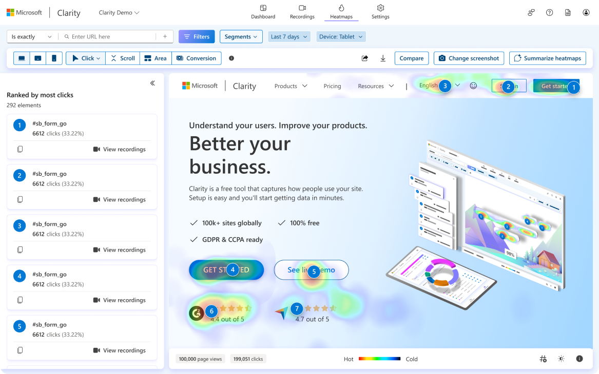
Scroll-depth tracking tools, like Google Tag Manager or Microsoft Clarity, allow you to visualize where users stop scrolling. For instance, if most users drop off just below the fold, it may indicate that your CTA is not prominent enough or that the fold design doesn’t encourage exploration.
3. Click-Through Rate (CTR)
Click-through rate measures the percentage of users who click on links or CTAs in your above-the-fold section. A low CTR often points to ineffective CTA placement, unclear messaging, or weak visual hierarchy. For example, moving a poorly performing CTA from the bottom-right corner of the hero section to the center might lead to a measurable increase in clicks.
Combining CTR data with heatmap analysis can help pinpoint underperforming areas and guide design adjustments.
Tools for Tracking Above-the-Fold Performance
Several tools are available to help you analyze user behavior and gather actionable insights:
- Heatmaps:
Tools like Hotjar, Crazy Egg, or Microsoft Clarity provide heatmaps that show which areas of your page receive the most clicks, hovers, and attention. A heatmap of your above-the-fold section can reveal if users are clicking on CTAs, engaging with navigation links, or ignoring key elements. - Scroll Tracking:
Use Google Tag Manager, Microsoft Clarity, or Hotjar to measure how far users scroll on your page. Scroll tracking data visualizes where users lose interest and can guide decisions on content placement and fold framing. - Session Replays:
Session replay tools like FullStory, Smartlook, and Microsoft Clarity allow you to watch recorded user sessions and observe how visitors interact with your above-the-fold content in real-time. This can reveal subtle behaviors, such as hesitation near a poorly worded CTA or frustration caused by a slow-loading hero image. - Analytics Dashboards:
Platforms like Google Analytics offer built-in metrics such as bounce rate, time on page, and exit rates, which can provide high-level insights into how users are engaging with your above-the-fold content.
Insights Derived from User Analytics

By analyzing metrics and user behavior, you can uncover valuable insights that inform design improvements:
- Insight #1: A heatmap analysis of a landing page shows that the majority of clicks occur on the navigation bar, while the primary CTA goes unnoticed. This suggests the need to reposition the CTA or enhance its visibility with color and contrast.
- Insight #2: Scroll tracking reveals that only 30% of users scroll beyond the hero image, indicating that the above-the-fold content is not compelling enough to encourage exploration. Adding a teaser or scroll cue could resolve this issue.
- Insight #3: Session replays reveal that users hesitate before clicking on a CTA, suggesting confusion or lack of trust. Refining the CTA text to clarify the value proposition or adding a trust signal, like a testimonial, can address this.
Best Practices for Optimizing Fold Performance Based on Data
Once you’ve gathered data, take action by applying these best practices:
- Test Variations: Use A/B testing to experiment with different headlines, hero images, and CTA placements to see which versions perform best.
- Encourage Scrolling: Include scroll cues, such as downward arrows or partially visible content, to guide users past the fold.
- Optimize for Speed: Ensure all above-the-fold elements load quickly, as slow loading times can deter users from engaging with your content.
SEO Implications of Above the Fold Content
The “above the fold” section isn’t just critical for user experience—it also plays a significant role in search engine optimization (SEO). Search engines, particularly Google, evaluate how content is structured and presented above the fold to determine a website’s relevance, usability, and performance. Factors like load time, content visibility, and adherence to Core Web Vitals directly influence rankings on the search engine results page (SERP). Ensuring your above-the-fold content meets both user expectations and technical SEO standards is essential for achieving higher visibility in search rankings.
How Search Engines Interpret Above-the-Fold Content
Search engines prioritize the content users see first. Above-the-fold elements—such as headlines, images, and primary CTAs—are assessed for relevance, quality, and engagement signals, which collectively contribute to SEO performance. For example, a clear, concise value proposition placed above the fold can improve dwell time, a behavioral signal Google uses to gauge user satisfaction.
However, poorly optimized above-the-fold sections—such as those cluttered with ads, irrelevant content, or slow-loading elements—can harm your site’s reputation in Google’s algorithms. Google favors websites that provide a seamless and engaging experience from the moment the page loads.
The Impact of Load Time on SEO Rankings
Page load speed is a critical ranking factor, and above-the-fold content plays a major role in determining how quickly a page becomes interactive. If the visible content takes too long to load, users may abandon the site, increasing bounce rates and negatively impacting rankings.
Google’s Largest Contentful Paint (LCP) metric, part of its Core Web Vitals, measures the time it takes for the largest visible element (often the hero image or headline) to render. To meet Google’s recommended LCP threshold of 2.5 seconds or less, ensure that above-the-fold elements—such as images and text—load quickly.
Key Tips to Improve Load Times:
- Optimize hero images using modern formats like WebP and compress them to reduce file size.
- Eliminate render-blocking elements such as unused JavaScript and CSS that delay loading.
- Use a Content Delivery Network (CDN) to reduce latency and improve load speeds across different regions.
- Implement lazy loading for below-the-fold content to prioritize resources for visible elements.
Core Web Vitals and Above-the-Fold Content
Google’s Core Web Vitals—LCP, Cumulative Layout Shift (CLS), and First Input Delay (FID)—are directly influenced by the design and performance of above-the-fold content.
- Largest Contentful Paint (LCP): Measures how quickly the largest visible element (e.g., hero image or headline) renders. Slow LCP times can result from unoptimized images, server delays, or poorly written CSS.
- Cumulative Layout Shift (CLS): Tracks unexpected visual shifts as the page loads. Above-the-fold sections with ads or large elements that load asynchronously can lead to high CLS scores, creating a frustrating user experience. To avoid this, reserve space for elements using defined height and width attributes.
- First Input Delay (FID): Although less relevant to visual content, FID measures interactivity. If users can’t immediately interact with above-the-fold elements, such as navigation links or CTAs, it could hurt rankings.
Above-the-Fold Ads and Google Penalties
While placing ads above the fold can generate revenue, overloading this area with advertisements can backfire both in terms of SEO and user experience. Google penalizes sites that display intrusive or excessive ads above the fold under its Page Layout Algorithm Update. This algorithm evaluates whether ads disrupt content accessibility and penalizes pages with poor ad-to-content ratios.
For example, a website with a banner ad covering 80% of the above-the-fold area would likely receive a ranking penalty due to diminished user experience. To avoid this, maintain a balance between monetization and usability. Use smaller, non-intrusive ads and ensure they don’t block essential content like headlines or CTAs.
Optimizing Above-the-Fold Content for SEO
To make the most of your above-the-fold content from an SEO perspective, follow these best practices:
1. Prioritize Key Information
Ensure that above-the-fold content is highly relevant to the target keyword or query. For example, if your page is targeting “best project management software,” the headline, subheading, and hero image should directly address this topic.
2. Use Descriptive Alt Text for Images
Images above the fold should include SEO-friendly alt text to help search engines understand their relevance. For instance, a hero image of a fitness app might include alt text like “Preview of [App Name] showing personalized fitness dashboard.”
3. Minimize Visual Clutter
Keep above-the-fold content clean and organized. A cluttered layout can confuse both users and search engines, leading to lower engagement and rankings.
4. Optimize for Mobile
Google uses mobile-first indexing, meaning that your mobile layout heavily influences your search rankings. Ensure that your above-the-fold design is mobile-friendly, with properly scaled images, readable font sizes, and touch-friendly CTAs.
Case Studies: Successful “Above the Fold” Design Examples
Analyzing real-world examples of effective above-the-fold designs can offer valuable insights into how top-performing websites engage users, communicate their value propositions, and drive conversions. Below, we’ll examine standout examples from e-commerce websites and SaaS platforms, breaking down what makes their “above the fold” sections successful.
1. Gymshark

Gymshark, a fitness apparel brand, has an engaging above-the-fold section that speaks directly to its active and fitness-focused audience.
- Hero Image: The hero section displays a lifestyle image of athletes wearing Gymshark gear, set against a clean background. This emphasizes the product’s functionality and style while connecting emotionally with the target audience.
- Headline: The headline is short and motivating: “Lightweight, Reflective Running Layers.” It aligns with the fitness theme and subtly positions the brand as a trusted companion in users’ fitness journeys.
- CTA: A bold, centrally placed button, “Shop Men’s” or “Shop Women’s,” makes it easy for users to start shopping immediately.
- Navigation Bar: The navigation bar includes product categories like “Men’s,” “Women’s,” and “Accesories,” with a dropdown menu for seamless exploration.
Why It Works: Gymshark’s above-the-fold design uses lifestyle imagery and concise messaging to resonate with its audience. The simple yet bold CTA makes it easy for users to jump straight into shopping.
2. Notion
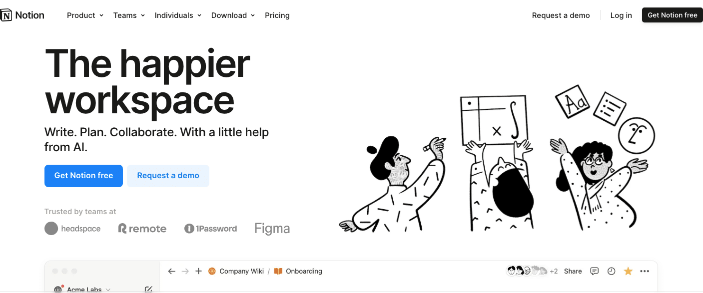
Notion’s landing page is a great example of how SaaS companies can create a compelling above-the-fold experience that communicates their product’s value in a clear and visually appealing way.
- Hero Image: The hero section features a clean, illustrated mockup of Notion’s interface, giving users a visual preview of the tool. This provides instant clarity about the product’s functionality.
- Headline and Subheadline: The headline, “The Happier Workspace,” is concise and impactful, while the subheadline explains the core benefits: “Write, plan, collaborate with a little help from AI”
- Primary CTA: A brightly colored CTA button, “Try Notion Free,” is placed prominently below the headline, inviting users to take action.
- White Space: Generous white space ensures the design feels uncluttered, making it easier for users to focus on the main message.
Why It Works: Notion’s design prioritizes clarity, showing users exactly what they can expect from the product while driving immediate action with a clear and visible CTA.
3. Allbirds

Allbirds, a sustainable footwear brand, excels in creating an engaging above-the-fold section that effectively showcases its products.
- Hero Image: The above-the-fold section features a close-up of their signature shoes, paired with a lifestyle shot of someone wearing them. This combination highlights both the product details and its real-world usage.
- Headline: The headline, “Let Confort Take You Places,” succinctly communicates Allbirds’ value proposition.
- CTA: A bold, centrally placed button, “Shop Men’s” or “Shop Women’s,” makes it easy for users to start shopping immediately.
- Navigation Bar: The sticky navigation bar includes links to essential categories, a search icon, and a shopping cart, enhancing usability without detracting from the hero section.
Why It Works: Allbirds’ above-the-fold design balances aesthetics and functionality, making it easy for users to both connect with the brand’s mission and take immediate action.
4. MailerLite
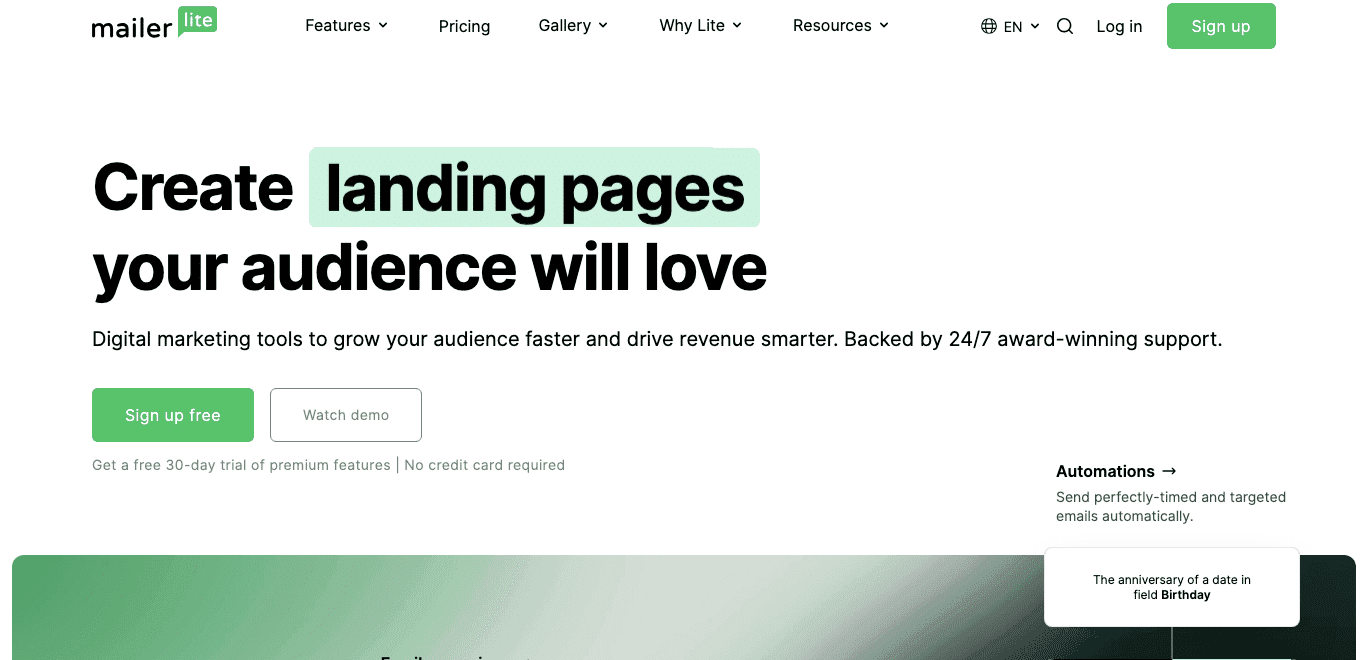
MailerLite, an email marketing tool, is a great example of a SaaS platform with an effective above-the-fold design that emphasizes simplicity and functionality.
- Hero Image: The hero section includes a clean interface mockup of the email creation tool, showing users what they can expect from the platform. This visual preview builds trust by providing transparency about the product.
- Headline: The headline, “Create Landing Pages Your Audience Will Love,” highlights the platform’s benefits in a clear and concise way.
- CTA: A bold, bright orange button, “Sign Up for Free,” stands out prominently in the center of the hero section. A secondary CTA, “Watch Demo,” caters to users who need more information before committing.
- Trust Signals: Below the hero section, MailerLite includes trust indicators such as “Trusted by 1 million businesses worldwide,” reinforcing credibility.
Why It Works: MailerLite’s above-the-fold section effectively combines a clear value proposition, appealing visuals, and actionable CTAs, making it easy for users to understand the product and take the next step.
5. Warby Parker

Warby Parker, known for its affordable and stylish eyewear, delivers a clean and functional above-the-fold design that emphasizes convenience and personalization.
- Hero Image: A well-lit image of a person wearing Warby Parker glasses is paired with a subtle background, showcasing the product in action while maintaining a polished aesthetic.
- Headline: The headline, “Expertly Crafted, Unexpectedly Affordable” focuses on the brand’s unique value proposition.
- CTA: A bold, centrally placed button, “Shop Men’s” or “Shop Women’s,” makes it easy for users to start shopping immediately.
- Navigation Bar: The navigation bar includes links to “Men’s Glasses,” “Women’s Glasses,” and “Contact Lenses,” along with a search icon for convenience.
Why It Works: Warby Parker’s above-the-fold design communicates the brand’s key value—convenience—immediately. By showcasing their standout offering (“Home Try-On”), they differentiate themselves while providing clear actions for users to take.
Innovations and Trends in Above the Fold Design
As user expectations evolve and technologies advance, “above the fold” design continues to innovate, offering new ways to capture attention, communicate value, and drive engagement. Modern web design now combines interactivity, personalization, and cutting-edge visuals to create impactful first impressions. Below, we explore the latest trends and innovations in above-the-fold design that are shaping the future of user experiences.
Interactive Hero Sections with Motion Effects
Interactive hero sections are becoming increasingly popular as they engage users immediately upon landing on a webpage. By incorporating motion graphics, micro-interactions, or parallax scrolling effects, designers can add depth and interactivity to the above-the-fold section without overwhelming the user.
For example, a travel website might use parallax scrolling to create a layered effect as users move their cursor or scroll, showcasing scenic destinations in the background. Similarly, an e-commerce site might include a subtle animation in its hero image, such as a product rotating or a text fade-in effect, to draw attention to key elements.
This trend works particularly well for brands looking to make their websites feel dynamic and immersive. However, it’s important to balance motion with usability—animations should enhance the experience, not distract or slow down the page.
Personalization and Dynamic Content Experiences
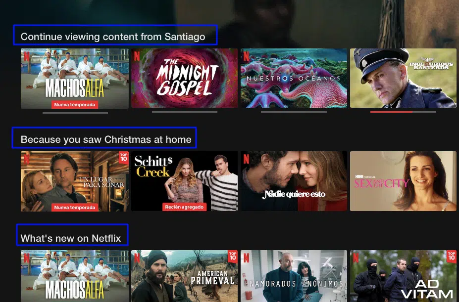
Personalization is revolutionizing how content above the fold is presented. By leveraging user data, websites can dynamically tailor their hero sections to individual visitors. This might include personalized headlines, location-based imagery, or product recommendations based on previous browsing behavior.
For instance, a streaming platform like Netflix customizes its above-the-fold section for each user, displaying tailored recommendations or recently watched shows. Similarly, e-commerce sites can show products that align with a user’s preferences or browsing history, making the experience feel more relevant and engaging.
Dynamic content not only improves the user experience but also drives conversions by delivering the right message at the right time.
Minimalist vs. Maximalist Design Approaches
Design trends have diverged into two opposing directions: minimalism and maximalism, both of which offer unique ways to engage users.
- Minimalist Designs:
Minimalism focuses on simplicity, emphasizing clean layouts, white space, and concise messaging. This approach works well for brands that want to communicate clarity and sophistication. For example, tech companies like Google often adopt minimalist above-the-fold designs to ensure users can focus entirely on the core message or action. - Maximalist Designs:
Maximalism, on the other hand, uses bold typography, rich visuals, and layered elements to create an impactful and attention-grabbing experience. It’s particularly effective for industries like fashion, where visual storytelling plays a key role. Websites adopting this style might include oversized images, vibrant colors, and multiple overlapping elements that make the design feel dynamic.
Both approaches have their strengths, and the choice often depends on the brand’s identity and audience preferences.
Video Banners and Backgrounds
The use of video banners and backgrounds in above-the-fold sections has grown significantly as high-speed internet becomes more widely available. Video content captures attention quickly, communicates complex ideas effectively, and evokes emotion.
For instance, a hospitality brand might use a short video clip of guests enjoying their resort to communicate luxury and relaxation immediately. The video’s movement draws the user’s eye, while the accompanying text and CTAs provide clear next steps.
To ensure usability, videos should be optimized for fast loading and set to autoplay without sound to avoid disrupting the user experience. Including a pause button or fallback static image for slower connections is also recommended.
Scroll-Triggered Content and Micro-Interactions
Scroll-triggered animations and micro-interactions have become a popular way to create dynamic, engaging above-the-fold experiences. These elements respond to user actions, such as scrolling or hovering, making the page feel more interactive.
For example, as a user scrolls, text elements might fade into view, or an icon might change color when hovered over. These small interactions guide the user’s attention and make the page feel more alive without overwhelming them. Stripe’s website is a good example of these micro-interactions.
Micro-interactions also enhance usability by providing subtle feedback. For instance, a button might change its appearance slightly when clicked, giving the user confirmation of their action.
Conclusion and Best Practices
The “above the fold” section serves as the digital first impression of a webpage. It’s the gateway to user engagement, conversions, and long-term success. Whether you’re designing for desktop or mobile, understanding the nuances of visual hierarchy, user flow, load time optimization, and content prioritization is critical. When crafted effectively, above-the-fold content not only captures attention but also guides users seamlessly through their journey on your website.
Here are some best practices and a checklist to help you refine your above-the-fold content and ensure it performs optimally:
Do’s and Don’ts for Fold Design
Do’s
- Prioritize the Most Important Content: Include a clear headline, compelling CTA, and a strong visual element communicating your value proposition.
- Optimize for Speed: Ensure all above-the-fold elements load within 2.5 seconds to meet Core Web Vitals requirements.
- Design for Mobile and Desktop: Adopt a responsive design that looks great across all devices.
- Leverage Visual Hierarchy: Use typography, color, and contrast to direct user attention to key elements.
- Encourage Scrolling: Use scroll cues or partially visible content to guide users below the fold.
Don’ts
- Don’t Overload with Content: Avoid cramming too much text, images, or CTAs in the hero section.
- Don’t Use Intrusive Ads: Keep ad placements minimal and non-disruptive to avoid SEO penalties and user frustration.
- Don’t Ignore Testing: Continuously A/B test your designs to see what resonates with your audience.
- Don’t Overlook Accessibility: Ensure that text is readable, buttons are clickable, and images include descriptive alt text.
Checklist for Auditing “Above the Fold” Content
Use this checklist to evaluate and optimize your above-the-fold design:
- Content and Messaging:
- Is your headline clear, concise, and benefit-driven?
- Does your subheadline support the primary message?
- Is your CTA prominent and action-oriented?
- Visuals and Layout:
- Are your hero images or videos optimized for fast loading?
- Does the design have enough white space to avoid clutter?
- Is there a logical visual flow guiding the user’s attention?
- Performance and Accessibility:
- Does your above-the-fold content load within 2.5 seconds (LCP)?
- Have you tested your layout on mobile, tablet, and desktop?
- Are all elements (text, buttons, images) accessible to users with disabilities?
- Engagement and Interaction:
- Do you use visual cues to encourage scrolling?
- Are interactive elements, such as buttons, easily clickable?
- Have you analyzed heatmaps and scroll data to optimize content placement?
Further Resources and Tools for Improvement
- Heatmap Tools:
- Use Hotjar or Crazy Egg to analyze user behavior and see where they interact above the fold.
- Performance Testing Tools:
- Test page speed and Core Web Vitals with Google PageSpeed Insights.
- A/B Testing Platforms:
- Tools like Omniconvert Explore can help you test different versions of your above-the-fold design to find what works best.
- Accessibility Testing Tools:
- Ensure your content is inclusive by using tools like WAVE or Axe Accessibility Checker.
- Responsive Design Frameworks:
- Leverage frameworks like Bootstrap or Foundation to build responsive, mobile-friendly layouts.


